Forms are how you get people to do things on your website.
And no matter the type of form you use, you need to make sure your form is easy to use—so that people fill it out.
If your forms give a bad user experience, people won’t fill them out. Which means they leave your website, never to become a customer—all because you formatted your form fields a little wonky!
That means you need to know how to make a good form.
Which types of forms will benefit from good form design?
- Lead generation forms—for when you want people to opt in to your email list or download a free offer
- Contact forms—for when you want people to get in touch
- Registration forms—for when you want people to sign up for your service or event
- Login forms—for when you want to make it easy for people to log in
- Checkout forms—for when you want to make sure people don’t abandon shopping carts
- General email capture forms—for any miscellaneous time you need to get someone’s email address
Unfortunately, there are a lot of bad forms out there.
Fortunately, designing a simple, effective form with good UX isn’t too hard.
Here’s how to make a good form.
Form design principles to follow (the 4 Cs of good form design)
When you need to make a good form, you need two things:
- Simple best practices, like where to put field labels and how to stack fields
- The principles that govern how to make a good form
You can learn a lot from things that other people have already tested—and in a second I'm going to list out a bunch of form design best practices that will make it easier for you to design forms.
But sometimes you need to use a form for something that hasn't been tested.
Or you're working with an audience that's, for whatever reason, different from most people who fill out forms.
Understanding the principles of form design gives you the tools to create a good form in any circumstance.
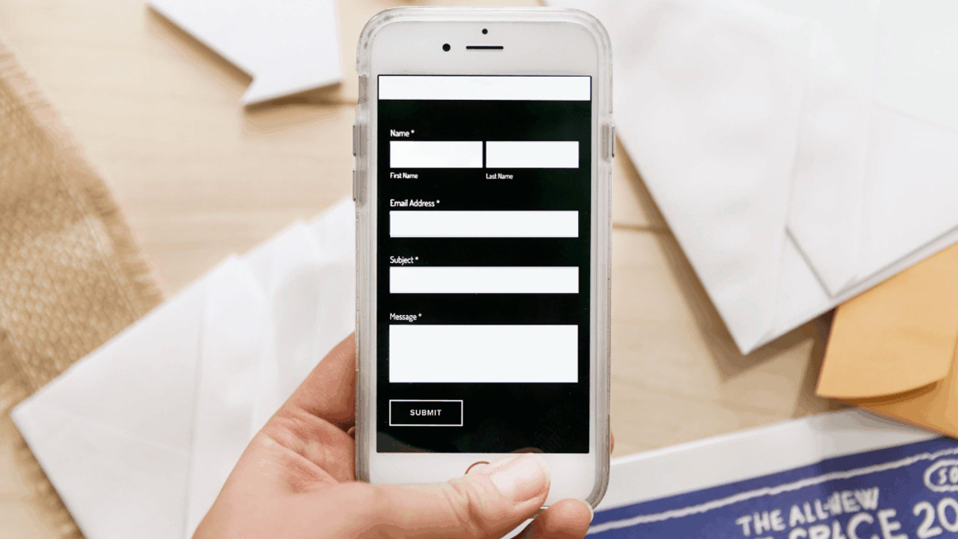
This form follows the principles
So. Here are the fast, specific tips that help you deal with common form user experience mistakes:
- Put labels above your fields, not as text that disappears within the field. Otherwise, when someone starts typing, they might forget which info you asked for.
- Stack fields vertically when there are more than two. Vertical fields are easier to scan than horizontal ones.
- Make it obvious which fields are required. Asterisks are common (or you can specifically call out optional fields).
- If there are more than 6 options for a form, use a drop-down menu. Ever heard of the Rule of 7? People can remember about 7 items, so if you have that number or more, don’t show them all at once as radio buttons.
- Use multi-step forms if you have a high number of fields—it can reduce friction
- Make your form fields different sizes based on the length of answer you expect. A form for a zip code should be shorter than one for a phone number.
- If you have error messages, it might be a good idea to add inline validation
- Don’t make your submit button say “submit.” Make it visually distinctive with a compelling microcopy.
A quick tip from Oli Gardner—ask for business emails

Sometimes people pay close attention to what they are being asked to do – whether they are tired, or just like clear instructions. In an experiment I've run several times, I've seen that by changing the field label to "Work Email Address" or "Business Email Address" you can collect more company branded emails (such as name@companyname.com as opposed to name@gmail.com).
The benefit to this is that when you are doing subsequent email marketing, your communications are going to their work inbox, often during work hours, when they're making business decisions. A simple, yet powerful hack."
– Oli Gardner is a renowned marketing speaker and co-founder of Unbounce, a platform that makes it easier to build and test landing pages
And then there are the principles behind good forms. These are the four Cs of good form design:
- Clear
- Concise
- Clever
- Cooperative
(Note: Credit to the team at Formulate for developing this 4 Cs model).
1. Clear forms are easier to use
Clear forms don’t make people think (and that’s a good thing).
There’s a reason this is like the bible of web design (Amazon)
What does it mean to have a clear form? It means that the person filling out your web forms should be able to do it with as little effort as possible.
A required field should be obviously required. Input fields should make it clear which inputs they’re asking for.
If you have a long form, the fields are clearly labeled and as painless as possible.
Clarity in your forms is critical. If any part of your form is confusing, you’re going to lose conversions!
And I mean any part of your form. That includes:
- Which parts are optional or required
- What info to fill out
- Which form fields go with which information
- What will happen after the form submit
- Why they should even fill out your form in the first place
Unless your form is something crazy intense that people are legally required to fill out (like tax documents) you need to make people want to fill out your form. That means you need a good, clear offer with good, clear opt-in copy.
And it means making your form as easy and painless to complete as possible.
When you design your form, ask these questions:
- Is it obvious what the form wants someone to do?
- Is it obvious which information is being asked for?
- Is it obvious what format that information needs to take?
- Is it obvious where each piece of information needs to be entered?
- If there’s an error, does the error message say how to correct it?
- Once information is entered, is it obvious what to do next?
2. Concise forms get more conversions
Concise does not mean short! It means no longer than necessary.
Yes, a short form will usually get more conversions than a long form. But:
- Sometimes a long form actually converts better than a short form
- Sometimes you really do need more information
- Sometimes you want to make sure that only the most interested people are reaching you
When conversion rate optimization expert Michael Aagaard shortened his form by three fields, he thought conversion rate would go up.
Nope. Conversions dropped 14%.
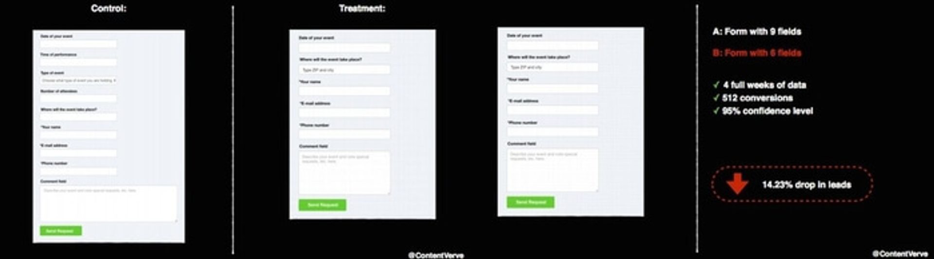
“The result? 14% drop in conversion. I removed all the fields that people actually want to interact with and only left the crappy ones they don’t want to interact with. Kinda stupid.” – Michael Aagaard, on ConversionXL
Some form fields are inherently higher friction (e.g. “phone number”) than others (e.g. “first name”).
Of course, you’d like as much information as possible about your leads. You just need to balance that against the information that people are willing to give you.
On the other hand, there are two really good reasons you might want to make a longer form:
- You really do need all that information to convert leads into customers
- You have a lot of website visitors and want to scare away the people who aren’t serious about your offer
Long forms are more common when you sell more expensive services, especially if you sell to businesses.
Even if your forms are long, make sure you’re only asking for the information you need.
And remember—you can turn a long form into a multi-step form to make it feel easier to finish.
3. Clever forms help people out
Clever doesn’t mean your form should have a bunch of puns. As we’ve written before, clarity is more important than cleverness—at least when cleverness means “being funny.”
In this context, “clever” means “smart.” Clever forms are forms that are smart enough to help your visitors complete them—by taking out irrelevant steps or making it easier for visitors to complete the steps that need doing.
What are some of those steps?
- Form fields that autocomplete—so your visitors can fill out their info faster
- Hiding form fields for information you already have
- Hiding form fields until prerequisite fields are filled in
- Only accepting some inputs for some form fields (e.g. an email address must contain @)
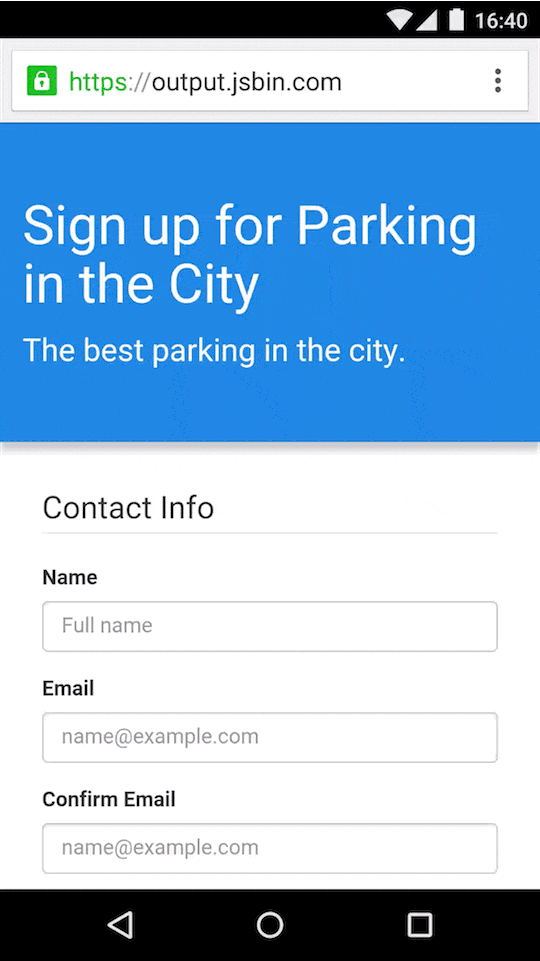
Google lets you autofill your information. This example (from developers.google.com) illustrates how much faster autofill is.
Making your forms smarter makes it easier for people to submit your forms.
4. Cooperative forms don’t make people frustrated
“Cooperative” is a more general principle than the other three. If a form is cooperative, that means it works with your visitors to make it easier to fill out.
The cooperative principle incorporates a range of best practices. For example, cooperative forms:
- Work with the mental framework that the form-filler is using when they approach the form
- Define terms and give context whenever necessary
- Uses terms that will be familiar to the type of person submitting the form
- Make errors obvious and give steps to fix them
- Accommodates some minor errors in inputs (misspellings, multiple formats)
- Ensure that there’s a valid, accurate response available for all form fields
- Asks questions that have valid answers, to eliminate “best fit” answers that don’t reflect the form-filler’s true beliefs/status/information
- Make it clear what’s expected of the form-filler, and what the form-filler can expect from filling out the form
Uncertainty makes people frustrated. Frustrated people don’t fill out forms and they don’t become customers.
A recent meta-analysis on the effects of uncertainty had this to say about how it affects decision-making.
“Uncertainty is often inevitable in everyday life and can be both stressful and exciting...Recent research suggests that biological organisms attempt to resolve and minimize uncertainty, as a means of optimizing inferences and predictions about the external world, and to ultimately promote survival success.”
When you run into a confusing form, what’s the fastest way to “resolve and minimize uncertainty?”
Not filling out the form!
That’s why cooperative forms are so important—they keep your form-fillers from getting frustrated.
And they get more people to fill out your forms.
Conclusion: What comes after a good form?
A good form is only the beginning of your visitors interaction with your business.
Good form design and powerful opt-in copy can get more people to submit your forms. After that, you’ll need ways to keep engaging your new leads and subscribers.
Here are a few ways to keep people engaged:
- Send them to a custom thank you page. A custom thank you page lets you direct people to more resources they might be interested in (and keeps them on your site)
- Make the next required step clear. Are you going to call them? Send a confirmation email? Do they need to do anything else right now? Make this obvious to them.
- Follow up (you can automate this). Send a welcome email. Trigger automated follow-up. Engagement is highest right after the form submits—so strike while the iron is hot and reach out now.
Learn how to make a good form. Make it. Then, follow up. Grow your business just by turning more of your visitors into leads—and customers.