
- They can’t find what they were looking for
- Your copy is confusing (don’t be clever, be clear)
- You’re asking for too much information
- There is too much clutter with images and text
- The colors make their eyes hurt
- They hate all forms (basically, it could be any number of reasons)
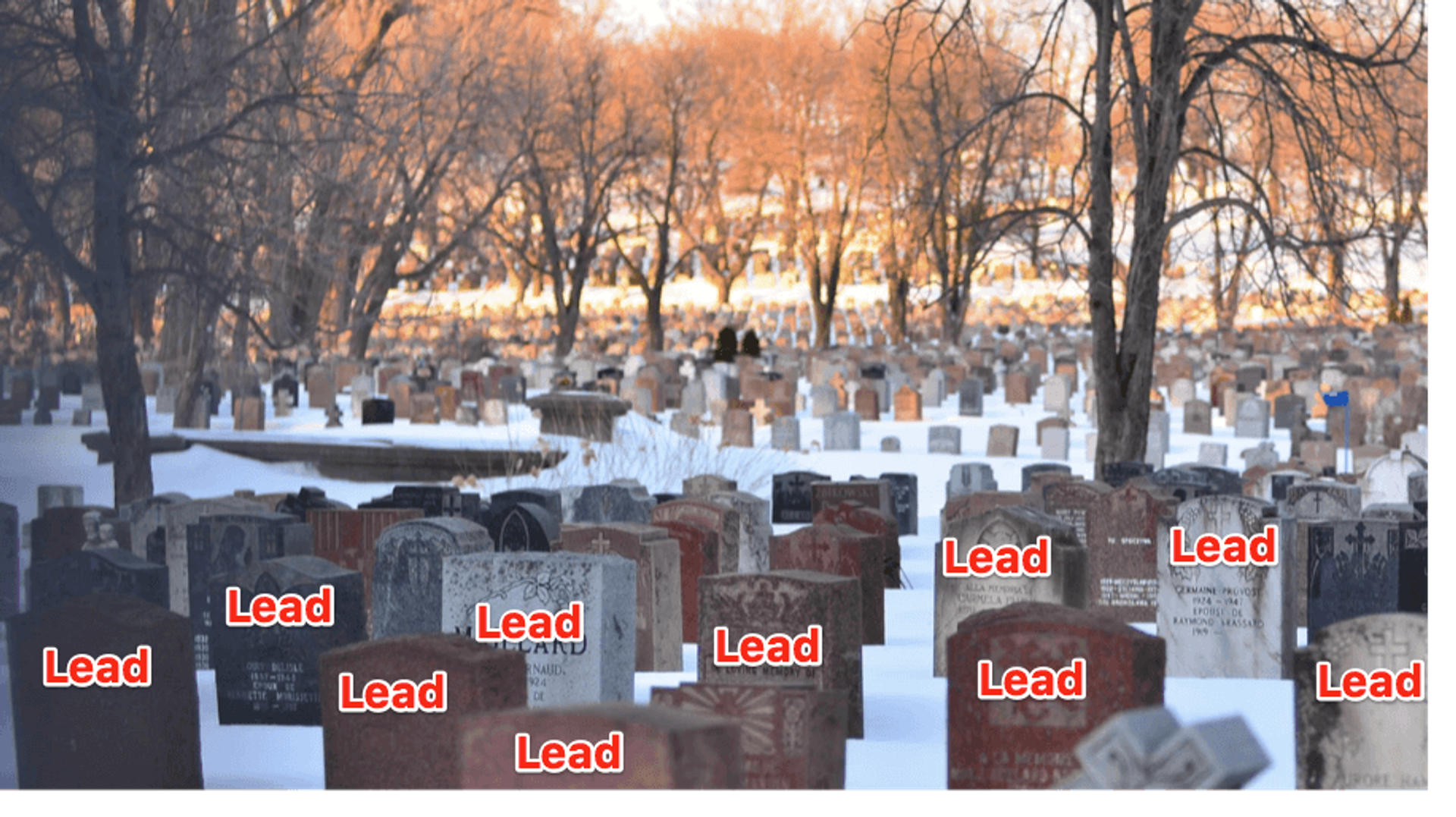
Rest in peace, almost-leads. You will be missed.
Good news for you though, because this post will teach you everything you need to know so that your leads will never stand you up again.If there’s one important thing to remember going into this post, it’s this – design isn’t just about how something looks; it’s also about how something works.Let’s do this.In this post, you’ll learn:- What a “good conversion rate” is (and what qualifies as a conversion)
- 3 myths about sign-up form “best practices” (that may not actually be best practices for you)
- The top 5 design mistakes you can make on a form (and how to fix them for a better conversion rate)
Make smarter marketing decisions.
What is a “good conversion rate?”
Generally speaking, an average email opt-in conversion rate is anywhere between 1-5%, but this varies depending on where your traffic is coming from (like forms, or Facebook Ads, or others).Of course, a number of factors beyond just traffic influence what your conversion rate will be. And, don’t get down on yourself if you’re currently on the low end of the spectrum.Because high conversion rates are not always what they seem.Higher conversion rates are great! Well, they’re great if they are actually worthwhile. Your conversion rate is only as qualified as your leads are.What’s qualified? A prospective customer who lines up with a buyer persona created based on needs, business type, budget, and other factors.And if you don’t have buyer personas clearly defined yet, it’s definitely time to do so.Did you know that organizations who define their ideal customer profiles will advance leads more often than those who don’t?That’s because they don’t waste their time on people who are never going to become customers (because they already know exactly what customers they want, and can get).In one case study, a cloud automation service provider clearly defined their target audience and increased:
- sales leads by 124%
- online leads by 97%
- organic search traffic by 55%
- North American site traffic by 210%

End the ghosting trend when you target the right people.
Converting less qualified leads is not only a waste of your time but also your money. So, pay attention to your numbers, but don’t let them fool you (or bum you out).Now, what exactly is a conversion? They can be any number of things, like...- Purchases
- Content downloads
- Page visits and clicks
- Opening and clicking an email
- Filling out a form and confirming a subscription
Are design “best practices” really the best practice for you? The answer may surprise you.
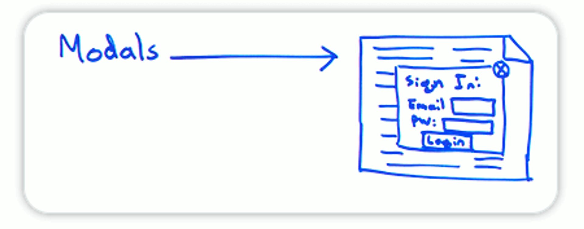
*Motorola voice* Hello Modal.
With modals, some people view these as good opportunities for customer interaction. More chance of interaction means more chance of conversion, right?Maybe. But, not necessarily for everyone.For some, the sudden appearance of a sign-up modal can also be seen as taking away from the customer experience.Personally, I sometimes get irritated if I’m halfway through a page’s content and suddenly a box appears blocking the rest of the sentence I’m reading.But, being irritated doesn’t mean I won’t still give you my email address.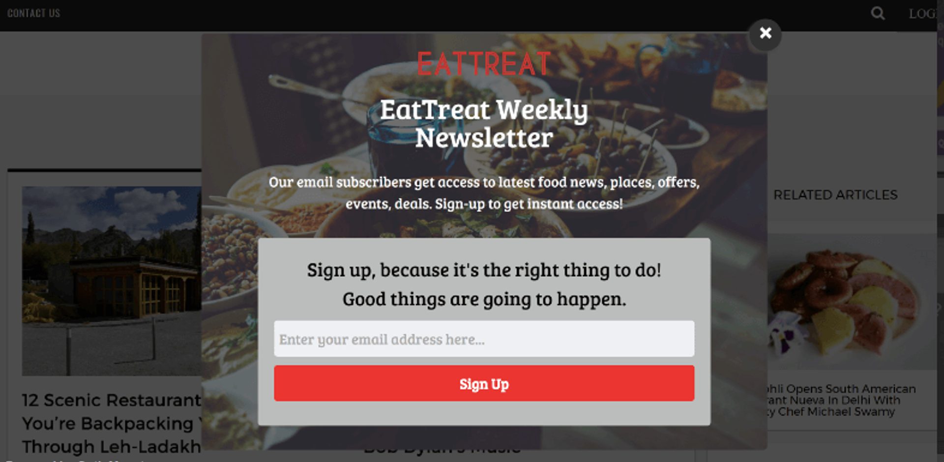
One of two reactions: “Trying to read here…” or “Weekly food news? Why didn’t you pop-up sooner?” Image from OptinMonster
That’s why best practices should really be called “best-educated guesses” or “common practices” (those just doesn’t roll off the tongue as easily).For that reason, we will go through 3 "myths" about designing sign-up forms. Get ready to be debunked (or rather, Devil’s Advocated).1. Shorter forms are better than longer ones
I’m calling this (and all of these best practices) a myth because it is. And it isn’t.Stay with me.On the whole, a shorter opt-in form with a simple design and only a few necessary information fields is going to be the obvious choice for marketers to give you as a customer.Less work = less friction = more conversions. Right?
Yes, often. But not always.Here’s one instance from a 2008 study with Imaginary Landscape where it definitely did. They reduced form clutter by reducing the number and type of required form fields.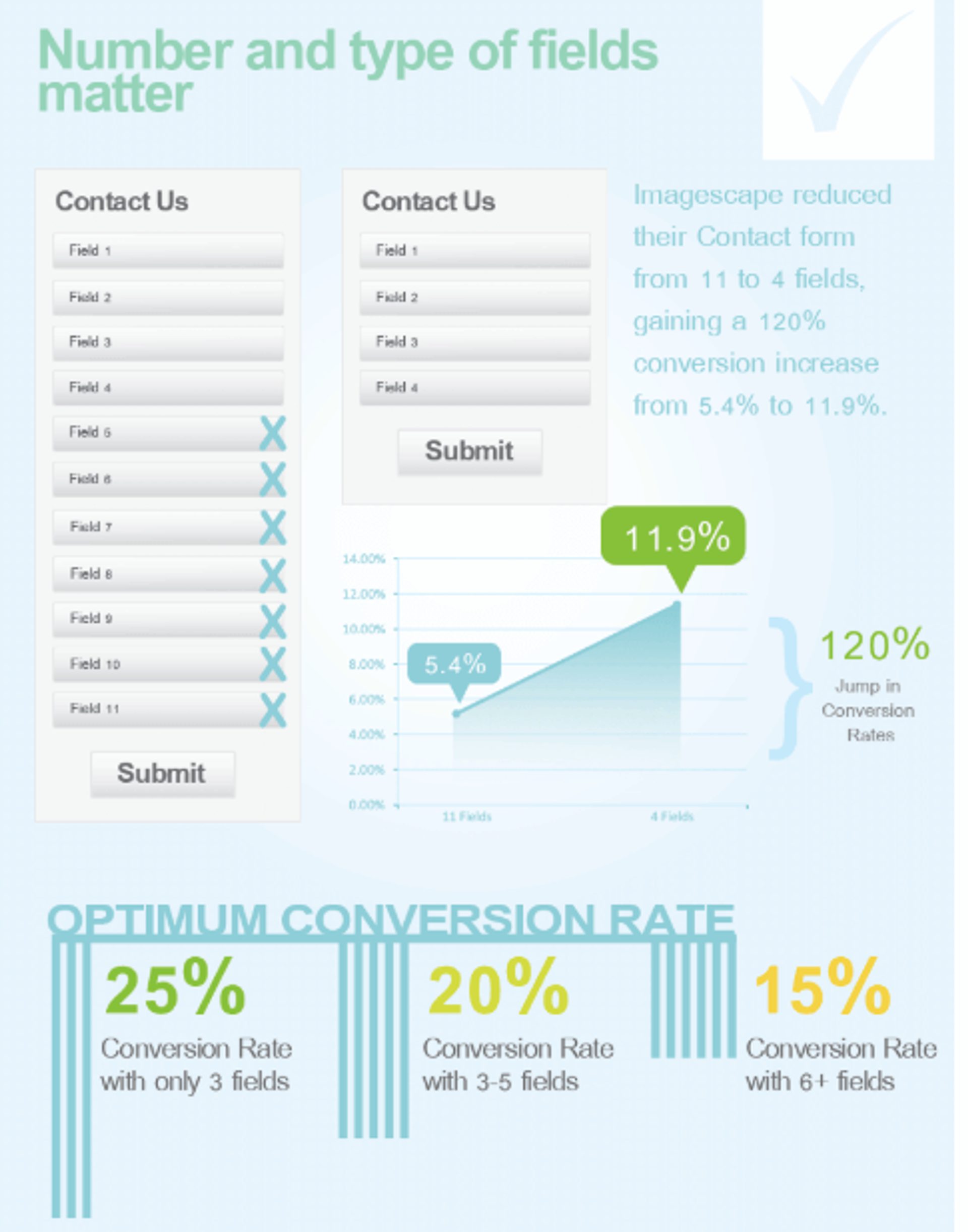
5.4% to 11.9% is quite the nice jump. (Source: Quicksprout)
However, more conversion research done by Michael Aagaard of Unbounce showed that, sometimes, longer forms can work better. Originally, he reduced the number of form fields and saw a decrease in conversions because he eliminated 3 fields that people wanted to engage with.To reverse the decrease, he put the fields back in and altered the copy instead. Ultimately, the longer form converted better than the shorter version from a simple copy change, not a length change.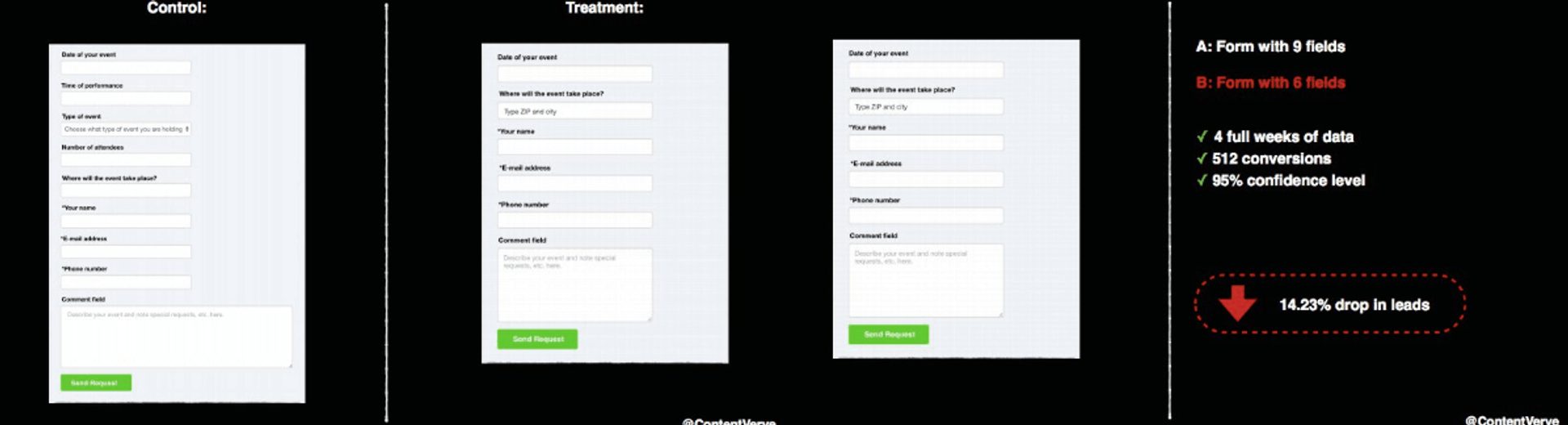
Poor, sad conversion rate.
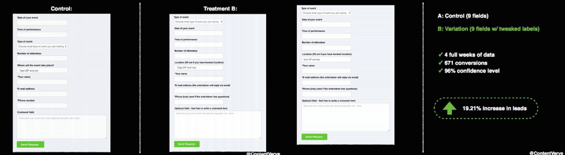
19.21% higher, well that’s a LOT better.
Sometimes, a longer form will contain the necessary information. This could be:- Including important information request fields
- Explaining the details of an ebook about to be downloaded
- A description of what to expect from a weekly newsletter.
2. Less friction = more conversions
While creating less work for customers is definitely a perk for them to complete a sign-up action, a little pushback may actually work to your advantage. Not all friction has the negative implications of the word itself.
3. The presence of security badges make customers more confident
This best practice could be considered a myth when it comes down to an issue of transparency.
It’s a lot like using the word “spam” on a form.On one hand, telling subscribers on your form that you won’t spam their email addresses is a nice, transparent thing to do. It instills trust in your brand and confidence in customers.On the other hand, mentioning the word spam at all might plant a small seed of doubt anyway. The presence of the word itself is sometimes enough to worry a potential subscriber so much that they don’t complete a form at all.The same can be true of using a security badge on a form.Adding a security badge might be killing your conversion rate. Sometimes the smallest reminder of the potential risks can deter more than it can reassure. But, again, transparency is important to people, so it might also do the opposite.The best way to find out what works best for your form design is to test it out.5 mistakes you’re making on your form (and what to do instead)
Mistake #1: The CTA button is boring
“Submit”
“Subscribe”Zzzzzzzzz…… *hand falls off the mouse and can’t click any button*If a CTA button is uninspiring or just makes you see the color beige when you read it, start making design changes here. This is the literal action point for potential subscribers, and everything from the copy to the color will make a difference.How to fix it: Make your call-to-action...well...an action (and an inspiring one at that). Use copy that is specific, decisive, and leaves no other option but to click.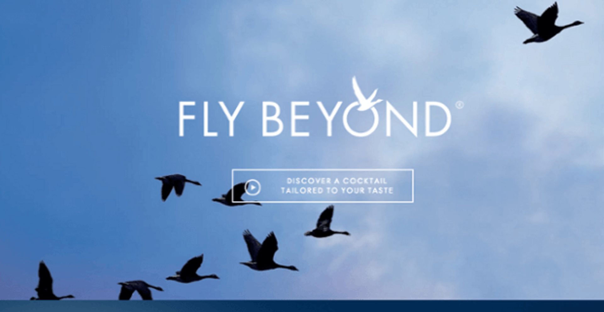
I fancy myself a tequila cocktail girl, but do I even know myself? Fly Beyond sounds like they might know me better. *Click*
Also, if you’ve ever watched as much HGTV as I have, you know that a “pop of color” or an eye-catching detail (like the flying birds in the above example) can make an impact on the success of the design.But, why stop at one CTA button? People like choices, so entertain the idea of providing an opt-in CTA button and an opt-out button (the odds are still in your favor when it’s done well).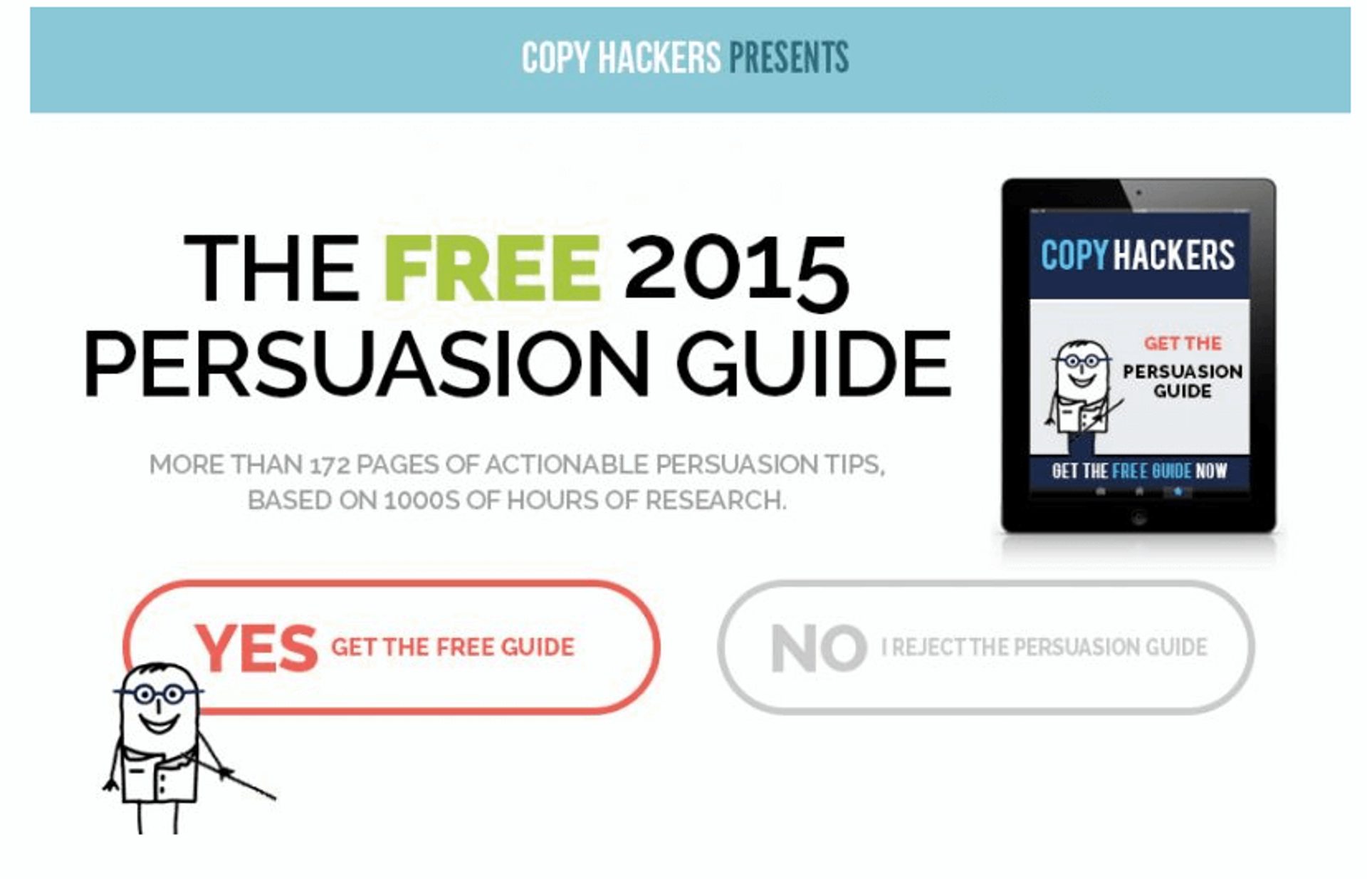
A choice is a fine thing. (Source: CopyHackers)
"I have to choose to opt-out, meaning that if I decide not to take the freebie offered, I have to choose (or say yes to) a negative consequence.
I don’t get to escape unscathed. If I decide not to opt in, I have to live with the consequences of my actions. “No, I reject the persuasion guide.” It’s the expressly stated alternative choice that sets up a clear consequence for not clicking the orange Yes button: rejection." - Joanna Wiebe, CopyHackers
Mistake #2: TMI(R) (too much information requested)
Earlier, we talked about how it’s a bit of a myth that shorter forms with less required info fields convert better. Sometimes they do, and sometimes they don’t. But a longer or shorter form is not mutually exclusive with the types of information you’re asking for.A longer form might include a bulleted list of necessary details, but for a first-time subscriber, you don’t need 10 form fields where 5 of them ask for either irrelevant information, or for information you can ask for down the line.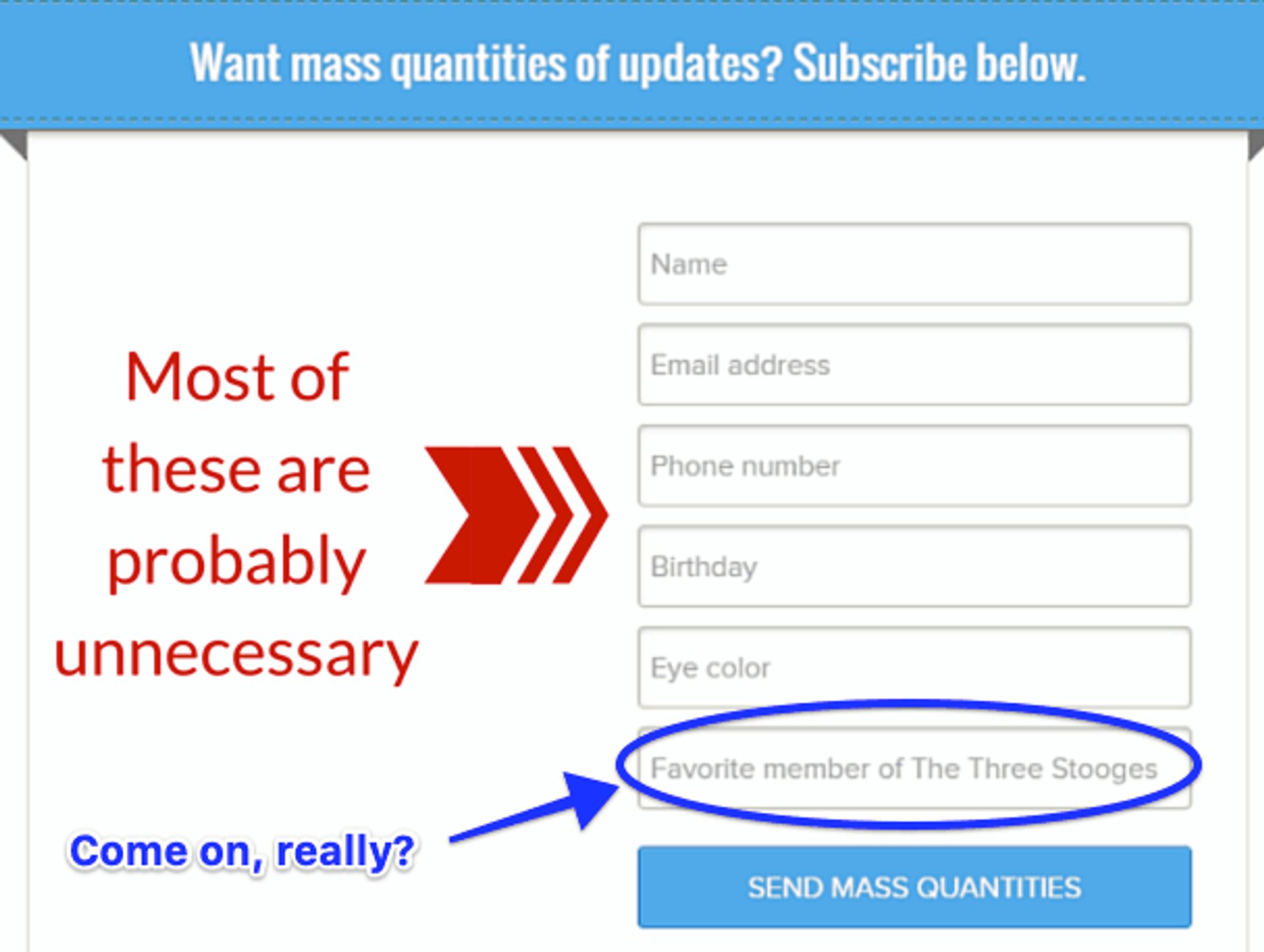
No….just, no… (Source: OptinMonster)
How to fix it: Chill. Out. And don’t require a phone number unless it’s ABSOLUTELY necessary. For a first sign-up form, don’t ask for what you don’t need.Think about this:Someone who you are trying to convert into a first-time subscriber is just getting to know you. You do not need to know their phone number, social security number, address, first pet’s name, nickname, or typically any information other than a name and an email address to start.Making unnecessary information a requirement (especially phone numbers) will ensure that it will be a long time before you see any sign-up conversions again.Mistake #3: You’ve underestimated the power of a progress bar
“Are we there yet?”Wouldn’t it have been nice if, on every family road trip, you had had a progress bar following your car to tell you how much was left to complete?A progress bar on a sign-up form accomplishes this.
Only 3 steps left, woohoo! (Source: Neil Patel)
People are naturally driven to complete goals. Showing exactly how close they are to completing a goal (or in this case a form) is a good way to incentivize them to cross the finish line.How to fix it: Test having a progress bar! It doesn’t even have to be an actual bar, it can be a checklist or some other organizational method that shows live progress and a light at the end of the tunnel.Mistake #4: There’s too much clutter in or around your form
Your form might be on a blog or a pop-up on the home page, or it might be its own landing page. Wherever it is, be careful of clutter.Imagine staring at a page that has a blog, 3 ads, a header, and a sign-up form on it. And that sign-up form has several images and large blocks of text that make it difficult to see the button.No thanks.How to fix it: K.I.S.S. (Keep It Simple, Silly). The best sign up page designs are simple.Your form might be an exit-intent pop-up, a lightbox, or on its own landing page (like many are). There are two things to consider for a landing page:- Placement
- Purpose.
Mistake #5: Low-quality copy and bad (or lack of) images
We’ve definitely mentioned this in a past post – don’t talk like a robot to your customers. Just like the aforementioned CTA button copy, the rest of the form copy should inspire action, but it should also be put into language that isn’t over everyone’s heads.
But it’s not all about words.
According to psychologist Albert Mehrabian, 93% of human communication is nonverbal. Visual components, like product images and graphics, improve comprehension and engagement of a subject. This is why quality images can help make a sign-up form more inviting.
How to fix it: Step into your audiences’ shoes. Study customer testimonials and use language that they would use. Consider what kind of imagery you would like to see as a visitor, look at what competitors are doing and make sure everything from copy to images is the best quality.
One lesser-known quote from a popular series, Gilmore Girls, comes from the grandmother Emily Gilmore, who knows quality.
“If you make it look cheap, people will think you’re unsuccessful.” (via GIPHY)
People are on the lookout for things that make a brand look less than legitimate. One small sign-up form design misstep can send them running to your competitors. Focusing on quality over quantity means the quality of your content, copy, brand colors, images, everything.Sign-up forms are supposed to increase your conversion rate, not kill it.Keeping these 5 mistakes in mind as you develop your own will help ensure that when it comes to forms, it’s all uphill from here.And remember – test, test, test!