Back in the early days of the world wide web, webmasters used splash pages to tell you to download Flash Player or turn your sound on for the best experience on their site.
Now, you can use splash pages to:
- Collect contact information
- Present a disclaimer or warning
- Ask for age verification
- Promote an event
- Highlight a specific product or service
- And more!
Read on for:
- What goes on a splash page?
- What’s the difference between a splash page and a landing page?
- 9 splash page examples for inspiration
- How to make a splash page
What is a splash page?
A splash page is an introductory screen a user sees when visiting your website. Splash pages are used to promote offers, show warnings or disclaimers, or call attention to time-sensitive announcements.
What goes on a splash page? Splash page design elements and use cases
A typical splash page has high-quality images and illustrations, a headline with a value proposition, a little bit of body copy, and a call to action with a form to submit.
The three most important elements of a splash page are:
- High-quality visuals
- Minimal (but important!) copy
- A call-to-action (CTA)
Try it now, for free
High-quality visuals
Splash pages feature high-quality visuals to grab visitors’ attention. These visuals are often someone’s first introduction to your website – so they should be on-brand, aesthetically pleasing, and relevant to your audience’s interests.
(Otherwise, visitors will leave your site before clicking through to your homepage or content.)
These visuals might be:
- Background images
- Product photography
- Video or animation (but be careful with these — they can slow down load time or not show up for users with an ad blocker enabled)
Minimal (but important!) copy
Keep your copy short and action-oriented. Don’t make your visitors read paragraphs of copy before they can access your site; odds are, they’ll click the back button and find what they’re looking for elsewhere.
Does your splash page clearly explain an offer that your visitors can’t get from your homepage or content? If not, reconsider whether you need a splash page at all.
(For more on creating valuable copy, check out our article on using market research to write great marketing copy.)
A call-to-action (CTA)
A CTA helps your customers take action quickly, then get back to what they came for (like your homepage or content).
Make sure that you also have an exit option somewhere on your splash page.
An exit option lets people get to your site without giving you their email address. If you force people to enter their email addresses or click through to a different offer, they’ll leave your site without taking action.
What else you put on your splash page depends on your goal. Other information might include:
- Age verification to access your website
- Sensitive content warnings
- Requirements for the best user experience on your site (like turn sound on, use Flash Player, run on a specific browser, etc.)
- Asking them to enter their email...
- In exchange for a discount code
- To access a content download
- To subscribe to your blog or newsletter
Try it now, for free
Splace page vs landing page: Top differences
A splash page is an introduction page to your site or content. It has an exit link that takes you to the main site where you can navigate to different pages. Landing pages often don’t have an exit link or other navigation – the goal is to keep the user on the page until they convert.
A splash page and a landing page have different goals.
A splash page aims to drive people to a specific CTA, collect contact information, and/or provide valuable info to your visitor.
A post-click landing page is a standalone page created for a specific conversion goal, like:
- Contest entries
- Newsletter subscribers
- Webinar registrations
- Content downloads
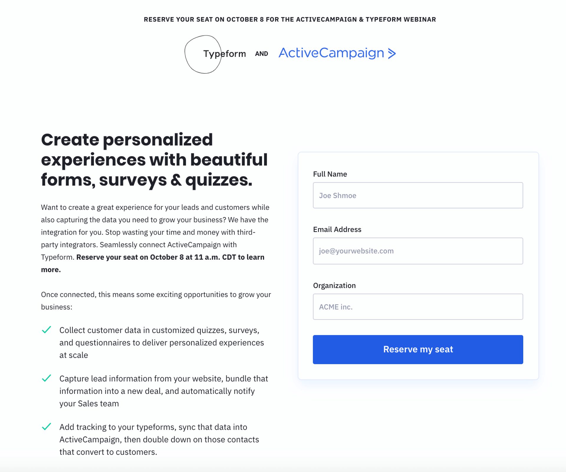
An example of a landing page: The signup page for ActiveCampaign and Typeform’s webinar. When you click on a link in an email, blog post, or social media post promoting the webinar, you’re taken to this page.
The page was designed with one goal in mind: to collect registrations for the webinar. Although this page technically lives on the ActiveCampaign website, it doesn’t have navigation or links to other parts of the site.
People land on a landing page by entering a campaign-specific URL or clicking on a specific call-to-action in an email, ad, or social media post. Landing pages are often designed to match the theme and messaging of a specific campaign.
If you're interested in learning more about how to write a landing page, click here!
9 splash page examples for inspiration
Here are 9 splash page examples to inspire your own splash page design (and what each one does right).
1. Age verification splash page (Tito’s)
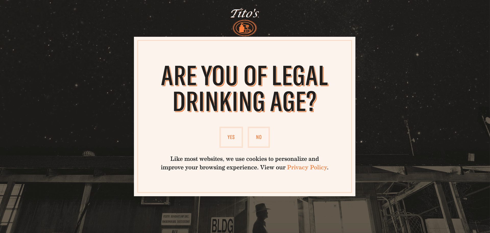
You can verify age with a yes or no question, like this one, or require visitors to enter their birthdate. (All based on the honor system, of course.) (Source)
What this page does right:
- It’s on-brand. The design uses Tito’s Vodka’s logo, brand colors, fonts, and overall Texas-but-make-it-classy vibe.
- Simple and to the point. Every bit of copy has a purpose. A paragraph under the header would be too much copy; more visitors would exit before continuing to the homepage.
- No exit link. I know, I just finished telling you how important an exit link is. But here’s the exception: Because it’s age-restricted content, you don’t want to give users the option to skip past this page.
2. Simple newsletter signup (Digiday)
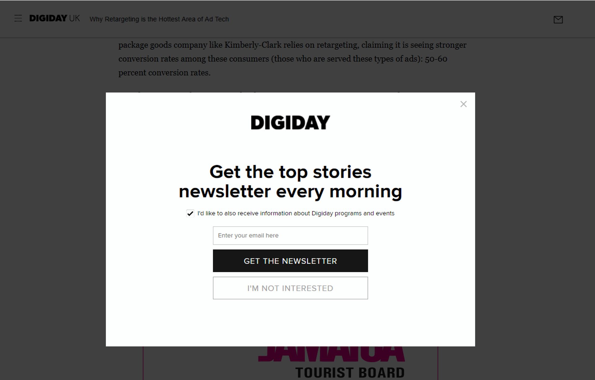
A splash page-style overlay on Digiday’s blog. (Source)
What this overlay does well:
- Tells the user what they’re opting into. In addition to the top stories every morning, visitors can customize their experience by choosing to receive information on Digiday programs and events.
- Two exit links. This makes it easy to get back to the blog post you came to read. (Which you can still see behind the overlay.)
- Clear CTA. You can get the newsletter, or you can carry it on to the site. The choice is yours.
3. A delicious newsletter signup (Gimme Some Oven)
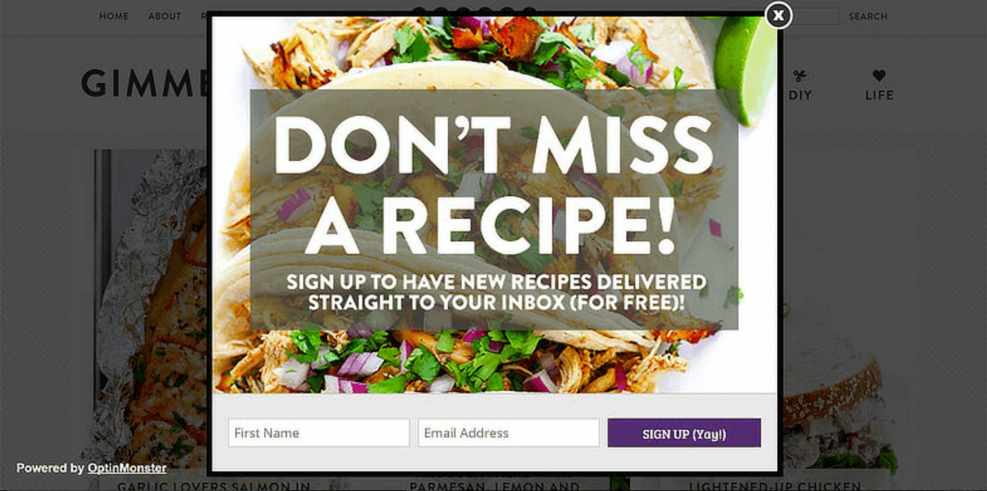
OptinMonster lets you create lead magnet popups like this simple overlay. (Source)
What this overlay does well:
- Enticing visuals. How good do those tacos look? The perfect image for a recipe blog.
- Clear, to-the-point copy. The value proposition here is clear: If you share your name and email, you’ll receive delicious new recipes.
4. Mobile-friendly email list signup (Tom Ford)
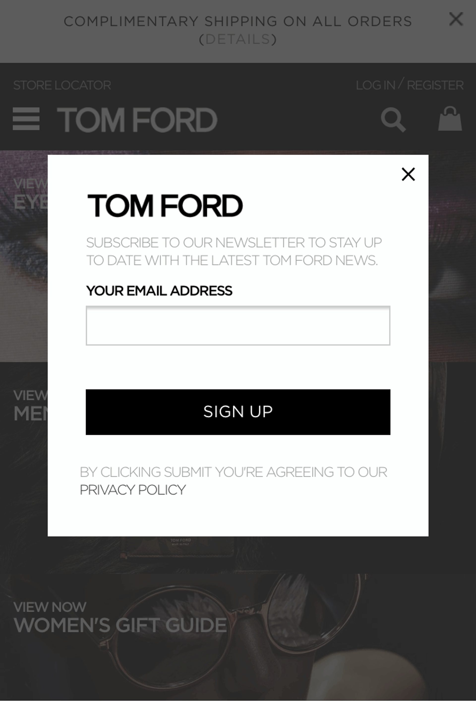
In the words of Jay-Z: “I rock Tom Ford.” And Tom Ford rocks the mobile-responsive overlay. (Source)
What this splash overlay does well:
- It’s mobile-optimized. The screenshot above is from the Tom Ford mobile site. More than half of all web page views coming from mobile; not having a mobile-optimized overlay or splash page means you’re missing out on half of all visitors.
- Asks for just one thing. Having one field — email address — makes it easy for visitors to sign up quickly, then get back to shopping. Don’t ask visitors to do more than what’s necessary for them to have a good user experience.
5. Creepy-cool email capture (KILLSTAR)
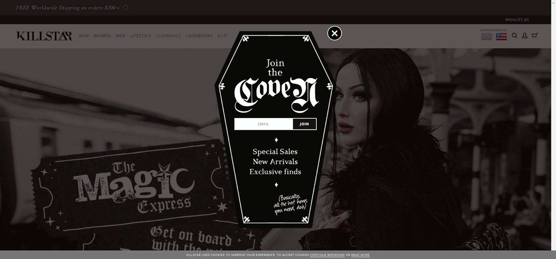
The perfect overlay to celebrate Halloween year-round. (Source)
What this overlay does well:
- Fun, on-brand imagery. KILLSTAR is “a Clothing & Lifestyle company with a twist of darkness” — so it makes perfect sense that their homepage overlay is shaped like a coffin.
- Copy that fits the brand personality. KILLSTAR could have written “join our email list,” but “Join the coven” sounds much more fun — and fits their brand personality to a T.
6. Email in exchange for a specific discount (J. Crew)
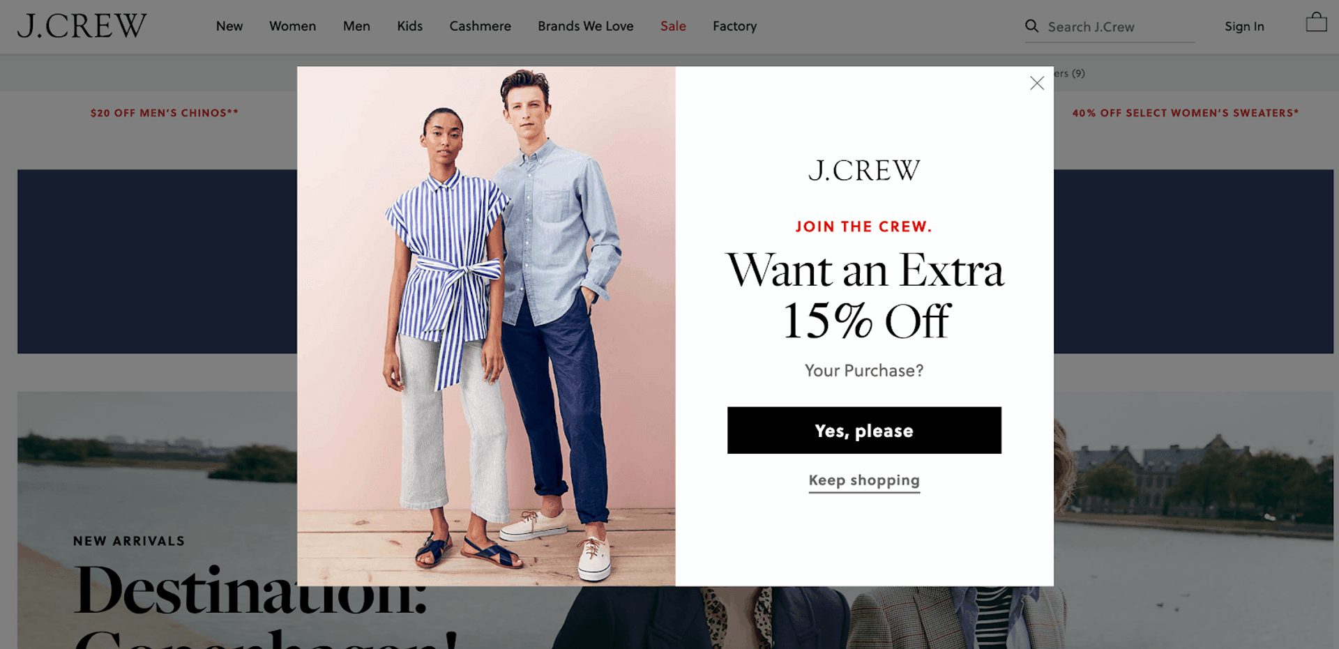
This splash overlay is a two-parter… (Source)
Then, when you click “Yes, please”:
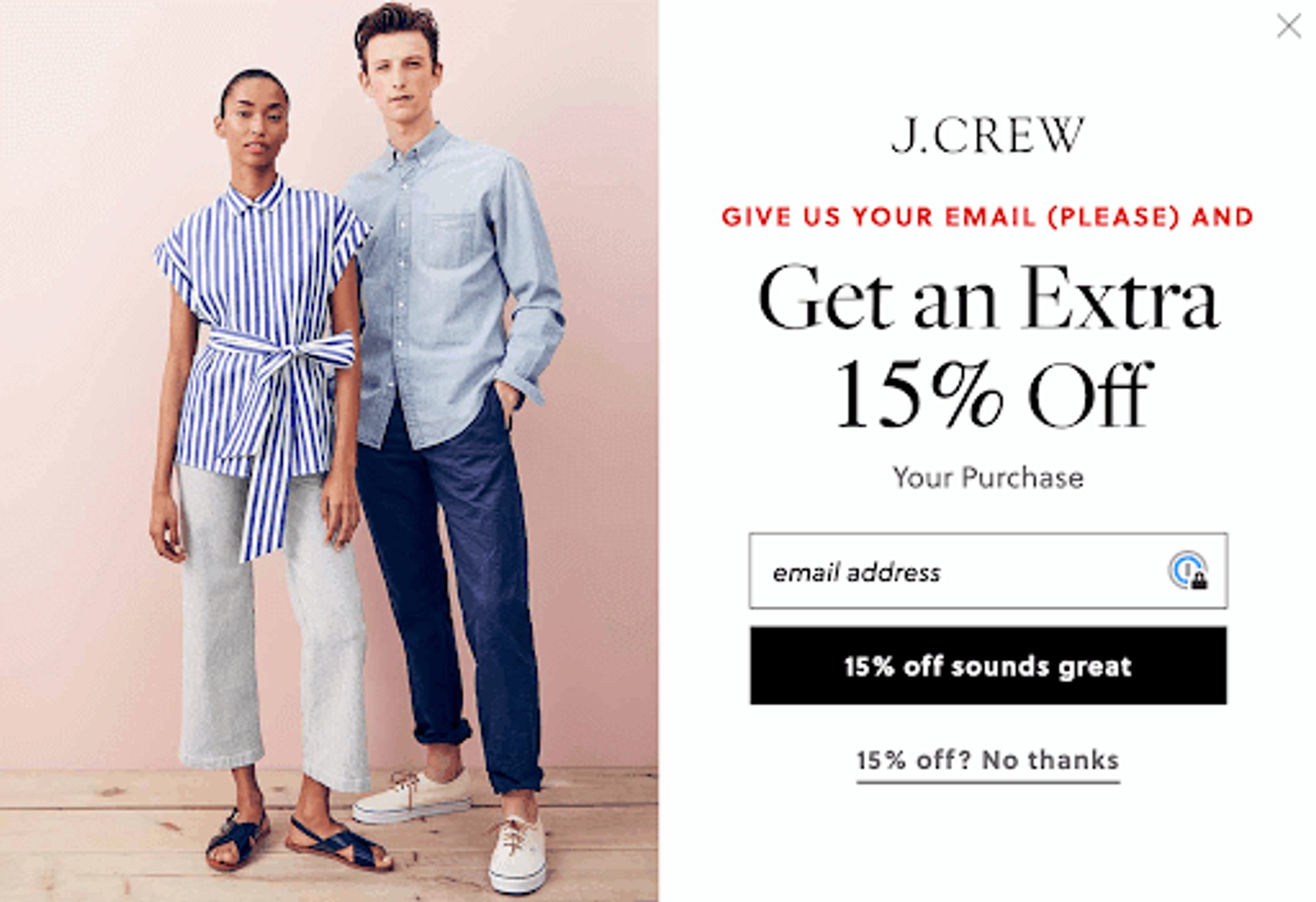
Who doesn’t want 15% off? (Source)
What this popup does well:
- Great product photography. The visuals here show off J. Crew’s products (great clothes), giving you an idea of what you can use that 15% off discount on.
- Inviting copy. “Join the crew” feels fun and exclusive (and is a play on the brand name).
- Easy opt-out. With an exit link at multiple points in the user experience, it’s easy for visitors to keep shopping without entering their email.
7. Gated content: Report download (Conversion Gods)
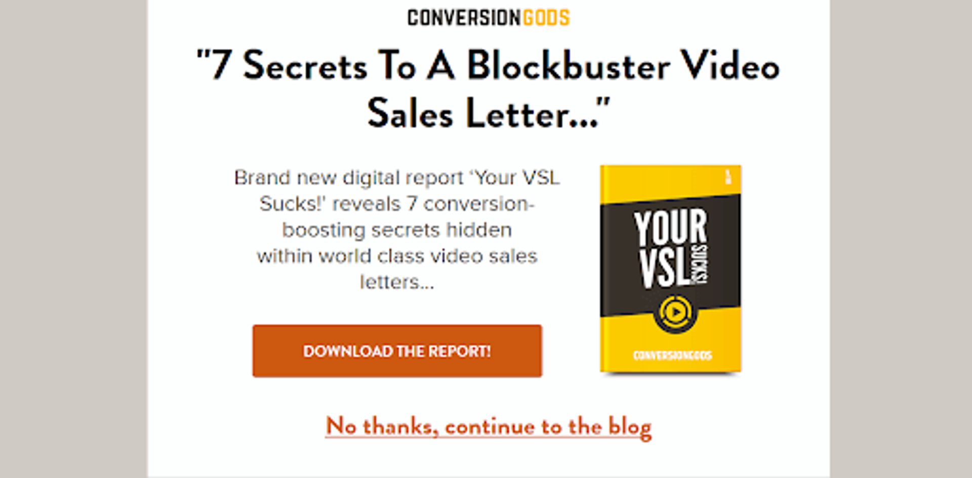
My VSL sucks?! That’s some tough love, but how can I argue with the Conversion Gods? (Source)
What this splash page does well:
- Big, bold exit link. If you’re not interested, you can be on your merry way. Again: Make it as easy as possible for your visitors to get to the content they’re looking for.
- Relevant content. If you’re looking at Conversion Gods’ blog, chances are they’re interested in learning the “conversion-boosting secrets” offered in this download.
- Simple design. No flashy gifs or animation here, meaning the page looks great on all devices and doesn’t slow down load time.
8. Language selection (Zara)

An international language picker for an international brand. (Source)
What this splash page does well:
- Beautiful, on-brand visuals. Zara is a fashion brand; this splash page screams fashion.
- Almost no copy. (Besides the cookie warning, which every website using cookies should have.) Minimal copy makes it even more visually striking.
- Clear purpose. To give you the best shopping experience, the website needs to know your language and location.
9. New album countdown (Muse)
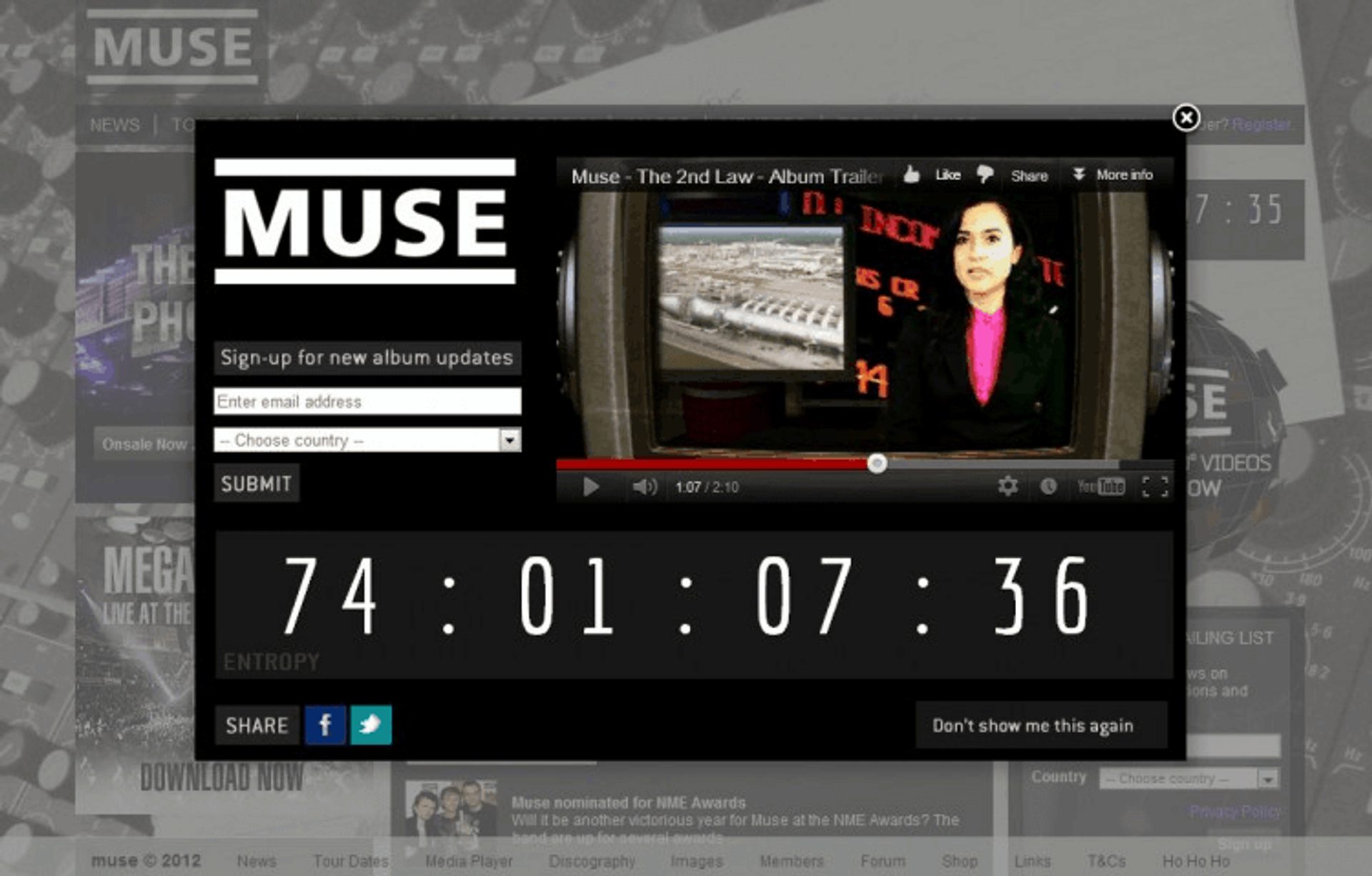
This 2012 album countdown is Madness! (Yep, that’s a Muse reference.) (Designed by Paul Seele)
What this countdown overlay does well:
- Exciting countdown. A countdown builds anticipation — and you don’t have to drop a new album to use a countdown! Countdown to a product drop, event, or webinar.
- Striking visuals. The album trailer video adds even more excitement around the upcoming release, which encourages fans to sign up for updates. Add a sneak peek of your product or event to get people pumped. (Before you add a video, do some load testing to figure out what elements might cause a slowdown. When you have a big announcement, you should anticipate more traffic, which makes load testing even more important.)
- Easy opt-out. This popup gives lets visitors opt out by clicking “Don’t show me this again.” This lets the user customize their experience (and not worry about being bothered by popups later on).
How to make a splash page
The easiest way to make a splash page is to use a marketing tool. If you use WordPress, there are many WordPress plugins that let you make splash pages. Drag-and-drop website builders like Wix also allow you to make a splash page. And pop-up tools like Sumo, HelloBar, or OptInMonster all have splash page options in addition to their other uses.
How do you design and set up a splash page for your website?
1. Consider using overlays or popups instead of an entirely separate splash page
A lightbox overlay or popup displays your splash page over the top of your visitor’s desired page. This lets them know they’re in the right place – plus they can exit out of the splash page if they’re not interested.
To learn more about how overlays, lightboxes, and modals affect your website’s SEO, check out this great article from Moz.
Bonus: ActiveCampaign lets you create modal-style forms for your website that can serve as a splash page or overlay. Submissions will be pushed directly to your CRM.
2. Make your splash page design responsive
Mobile devices account for over 51% of all web page views – make sure your splash page works for all visitors. Work with your designers or choose a responsive template in your site builder to make sure your splash page adjusts according to the screen width of each visitor.
3. Help your users get where they want to go
Make sure that once the visitor completes your CTA — or opts out — you send them through to the page they originally wanted to visit. Your customer does not want to be redirected to your homepage when they’re trying to read an article on your blog.
4. Keep it simple
Create a better user experience and ensure faster load times by keeping your splash page as simple as possible. Get straight to the point with your copy and CTA, use simple JavaScript and minimize the amount of video, animations, and plugins on the page.
5. Keep an eye on analytics
Once you have your splash page up and running, track results to see whether it’s hurting or helping your website performance.
Depending on your goal, you can track:
- Bounce rate
- Time spent on page
- Click-through rate
- Form submissions
If your results suffer after you add a splash page, you might not be providing enough of an incentive, enough valuable information, or an intuitive user experience.