“At their core, landing pages that convert speak directly to real people with real problems in search of real solutions.
And people are people. This means that the rock-bottom, non-negotiable, absolutely essential elements to every high-converting landing page are the same.” – Aaron Orendorff
Imagine: You launch your amazing PPC campaign through Google or Facebook ads. You’re getting tons of clicks. But… Your conversion rate is low. Really low. Lower than the 4.02% average.Or at least... lower than you want it to be.Your landing page has one job. And it’s not working.What gives? How do you build a high-converting landing page?This video is a segment from “Growth Decoded” — a show that investigates the relationship between the customer experience and business growth — one topic at a time. Register here and never miss an episode!
Keep reading for 8 reasons your landing page isn’t converting — and how to fix each of them:- Visitors don’t trust you
- You have too many distractions
- You talk too much
- Your messages don’t match
- You’re too demanding
- Your CTA sucks
- You don’t create urgency
- Your offer just isn’t good enough
Reason 1: Visitors don’t trust you
The fix: Use social proof
Video testimonials and reviews are powerful ways to build trust. For reviews, use badges from trusted review sites like Trustpilot or G2. Show visitors how people just like them have benefitted from your product or service.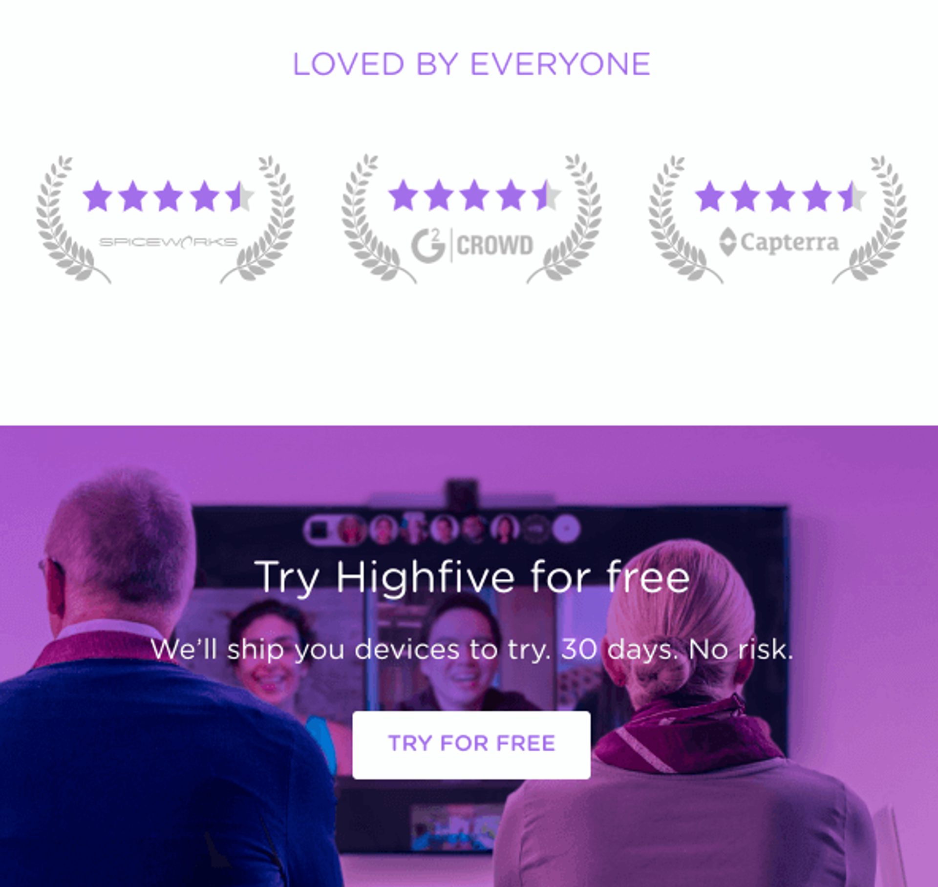
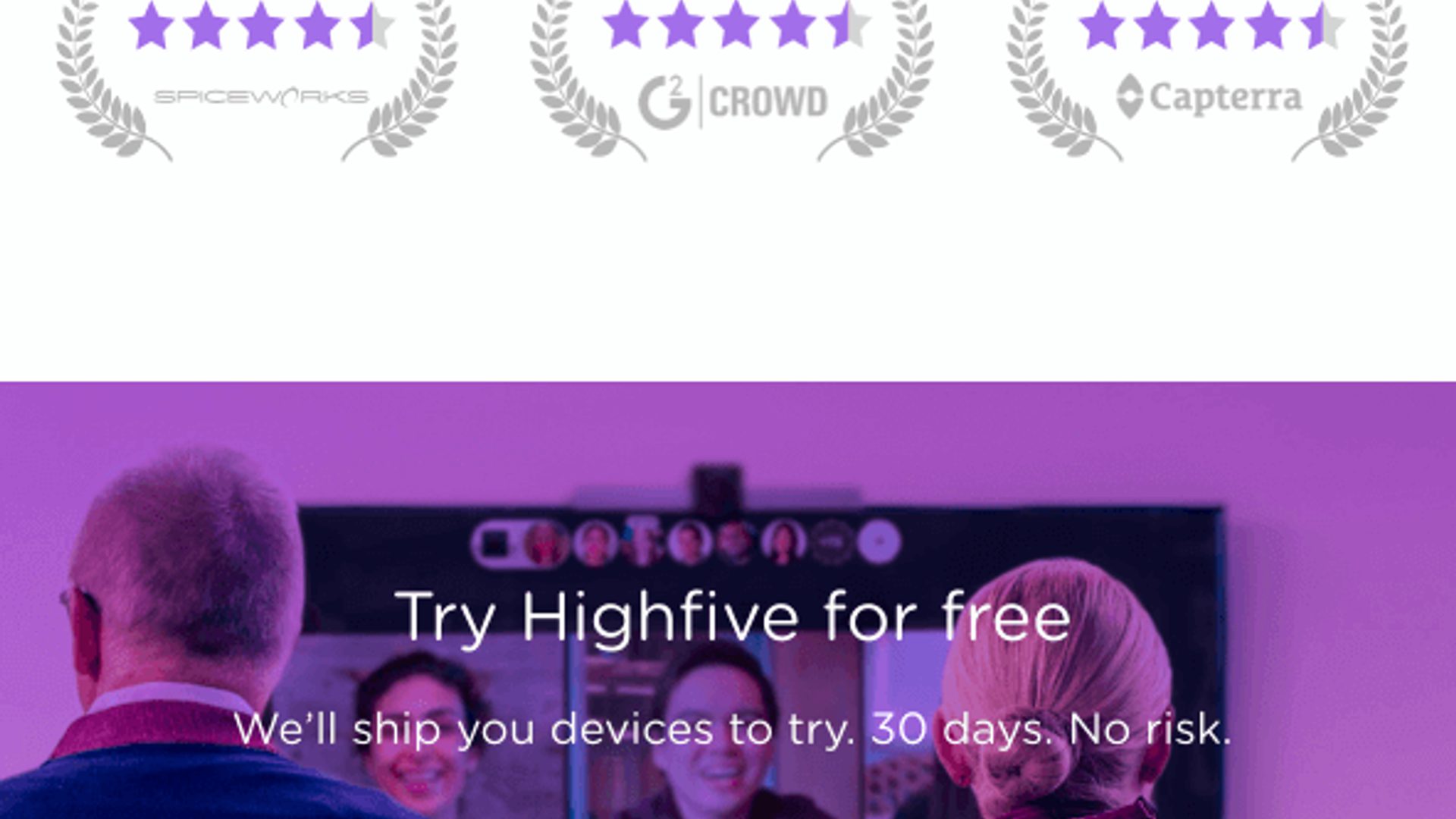
Highfive shows ratings from review platforms like G2 and Capterra on this landing page. High ratings from these trusted sources can help convince visitors to convert — especially when you display the reviews right above the CTA. (Source)
Make sure your social proof is credible. Ask yourself: Would I believe these reviews and testimonials if I saw them on a competitor’s landing page?
Another key to building trust: what Ann Handley calls “pathological empathy.” Use your copy to prove to readers that you understand how they feel. Use conversational language — not sales-speak. Remember that your visitors are human!Reason 2: You have too many distractions
“Your landing pages aren’t Wikipedia. Stop adding unnecessary links yo!” – Oli Gardner
Does your page have:- A navigation bar?
- In-line links (which give people a reason to leave before converting)?
- Multiple CTAs?
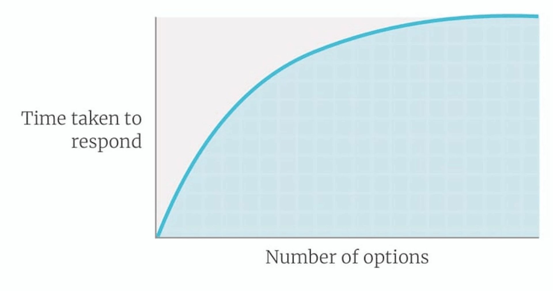
A graph of Hick’s Law, aka decision paralysis. (Source)
The fix: Focus on one offer
Pick one offer for your landing page. One offer means one goal: get visitors to convert. Make every single element on your landing page contribute to your one goal. If it doesn’t support that goal, get rid of it.Have multiple offers for multiple audiences? Website personalization can show a unique offer to different page visitors."Make it clear that you're asking the visitor to make a choice. Anything not designed to make the visitor more comfortable and confident probably doesn't belong on the page." – Brian Massey
Research shows that removing your navigation menu can increase your conversions by 100%. Other research shows that having just one CTA on your landing page leads to higher conversions — but over 68% of businesses have 5 or more!If your call-to-action is to sign up for a webinar, everything on your landing page should support that call-to-action. A simple design with a big, clear font and lots of white space helps keep people focused on your CTA.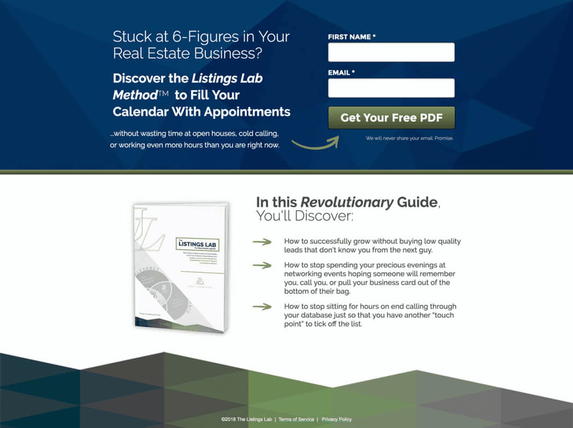
The goal of this Listings Lab landing page: PDF guide downloads. Everything on this landing page ladders up to that goal. (Source)
Reason 3: You talk too much
The fix: Keep your copy simple
To paraphrase John Mayer: “Say (only) what you need to say.”Make it scanner-friendly! 79% of people scan a web page rather than reading every word. Ask yourself: If I scan my landing page for 8.25 seconds, is it clear what my call-to-action — and its benefit — is?Make your landing page easier to scan:- Use bulleted lists (like this one!)
- Use headers and subheaders to emphasize the benefit of converting
- Use images and videos to help get your message across
Reason 4: Your messages don’t match

The fix: Make it consistent
Carry your theme and call-to-action from your ad, email, or post through to the other side of the click.Message match also means not sending all traffic to the same landing page.Research shows that businesses with 10-15 landing pages tend to increase conversions by 55% compared to those with fewer than 10 landing pages. And those with more than 40 landing pages increase conversions by over 500%. Make your landing page specific to each ad or campaign.Or, as Oli Gardner says, NSAMCWADLP: Never Start A Marketing Campaign Without A Dedicated Landing Page.Think of it this way: If you switched your tone of speaking voice halfway through a conversation, people would be weirded out. The same applies to your landing pages.Reason 5: You’re too demanding
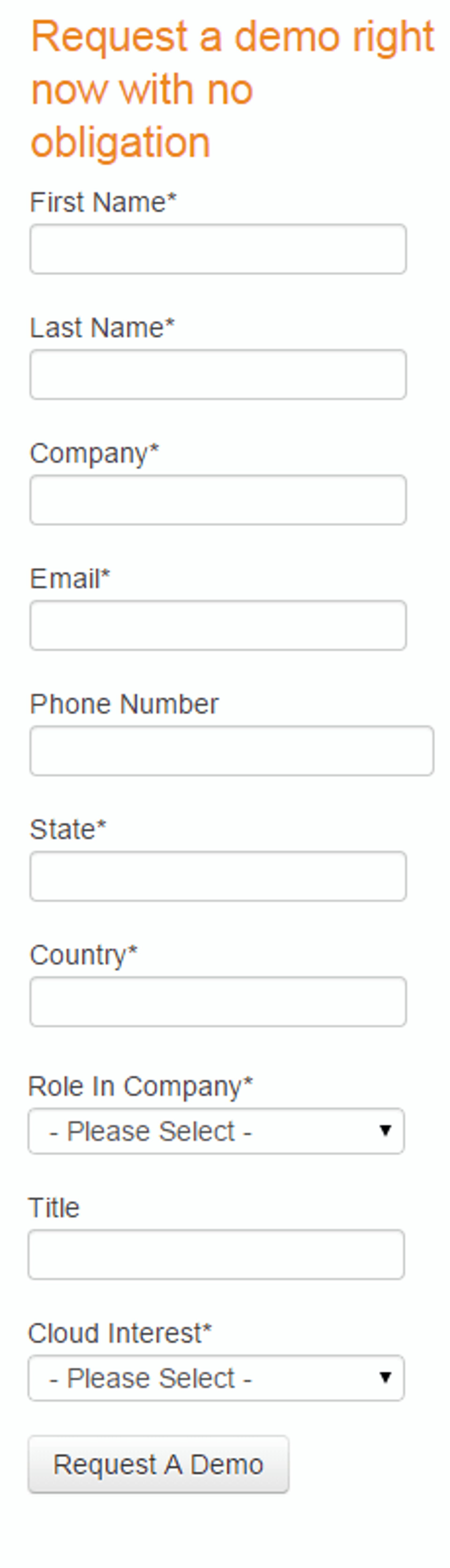
This form to request a demo from an enterprise datacenter provider is far too long. They do not need all of that information to give a demo. (Source)
The fix: Only ask for what you need
To build trust, your visitors should never ask themselves why you need the information you ask them for. You can get more from people once you nurture your leads and address any concerns they have about your product or service. The value of what you ask for should match the value of what you offer; a free ebook should ask for less information than a higher-value offer like a free in-person consultation.- “What if I don’t have time?”
- “What if I change my mind?”
- “What if I can’t figure out how to use this?”
Reason 6: Your CTA sucks
- “Download now”
- “Buy now”
- Or the worst: “Submit”
The fix: Follow these CTA best practices
Here are 3 CTA best practices for your landing page:- Only have one CTA. Include too many links, and people might decide not to click through at all. (The psychological phenomenon behind this is called analysis paralysis.)
- Make your CTA button stand out with contrasting colors.
- Make your CTA specific to the benefits of your offer. If your content offer is a landing page optimization ebook, don’t just say “Download now” or “Get the ebook.” Instead, use powerful language: “Discover landing page best practices” or “Increase your conversion rates.”
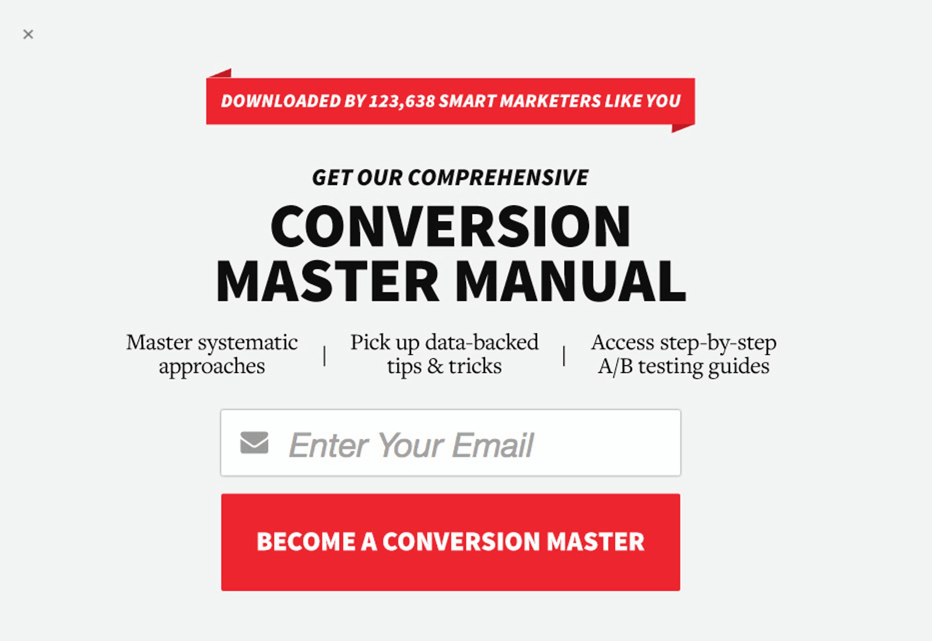
Who doesn’t want to become a conversion master? This CTA is way more enticing than “Download now” or “Submit.” (Source: ConversionXL via Wishpond)
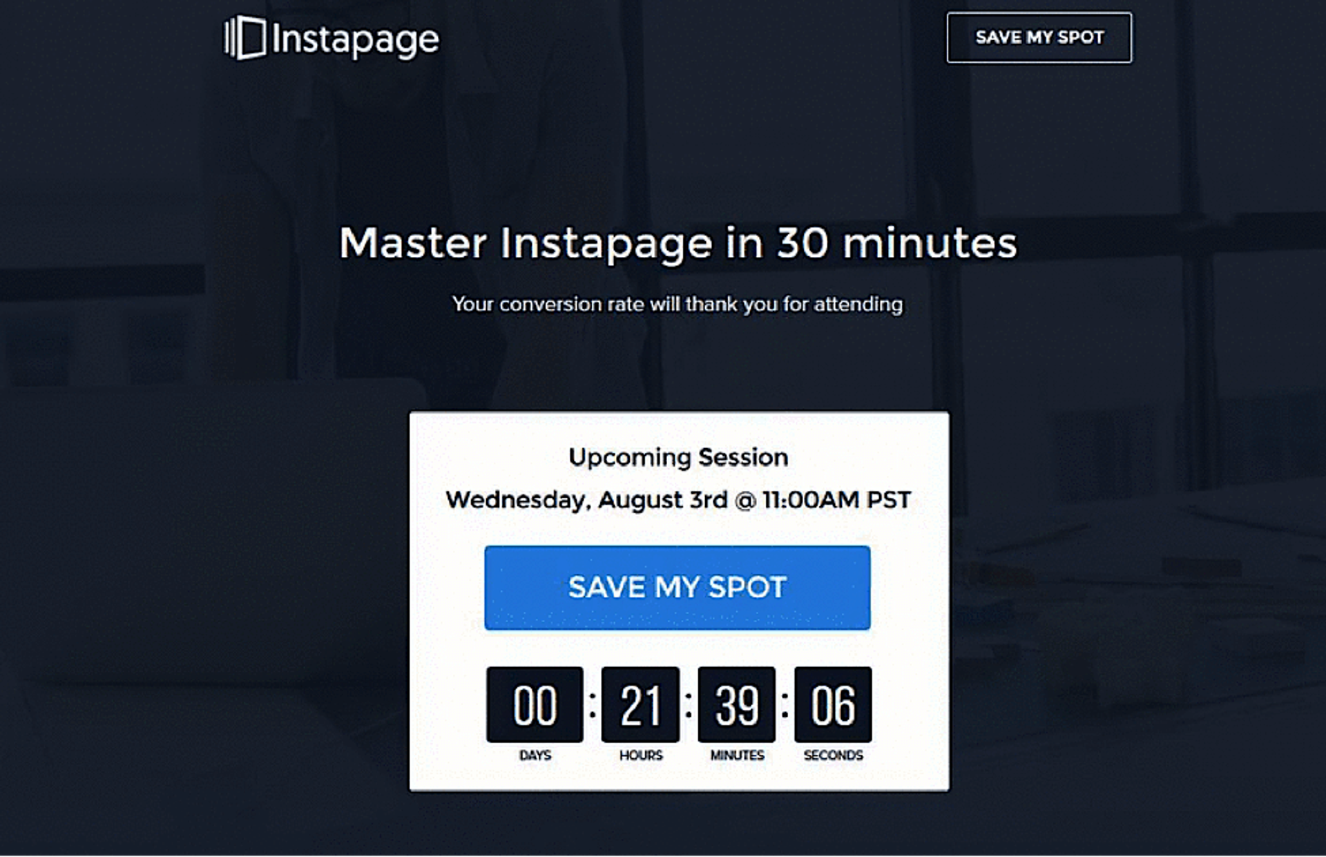
Reason 7: You don’t create urgency
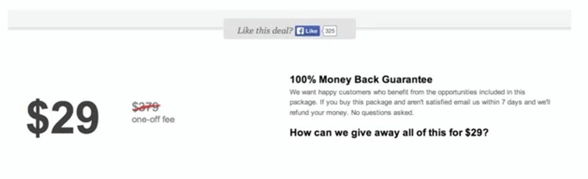
Variation A has no sense of urgency — you can always come back tomorrow and still get all of this for $29.
Against Variation B: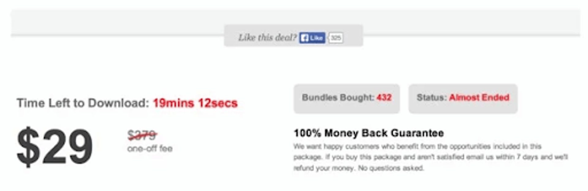
Variation B has a countdown timer, a count of how many bundles others have purchased, and the status of the deal’s availability.
The results? Variation B converted at a rate almost 3 times that of Variation A. Urgency works.The fix: Up the stakes
Deadlines motivate people to take action, so use them to create some urgency! For urgency to work as a persuasion technique, you need to convince people that acting now is the best option for them.To create urgency, use:- Limited-time offers: “Only available for the next 24 hours!” (A countdown timer works great here.)
- Time-sensitive reminders: “Sign up in the next hour to receive a free trial.”
- Stock scarcity: “Only 5 spots remaining for the webinar!”
Reason 8: Your offer just isn’t good enough
“The success of your landing page is 98% about the offer. Make it as good as possible. Make it about the user. Forgot 10% off. Real value. Work on your offer more than anything. Then just put it on an undistracted landing page, and odds are it will work great." – Peep Laja, Founder of ConversionXL
The fix: Put yourself in your customers’ shoes
Imagine you visit your landing page for the first time, knowing nothing about what your business does. Ask yourself:- Would the offer entice you to sign up?.
- What clear benefit will people receive from your offer?
- Are there any additional incentives for your call-to-action?
- Gated content (like a free ebook download)
- Access to an exclusive event
- A webinar on a relevant topic
- A free quote or consultation
- A free trial or demo of your product