What do email lists, newsletter subscriptions, and free SaaS trials all have in common?
They all start with a sign-up form.
That’s right — so many important lead generation activities begin with this simple tool to collect customer data.
You’ve probably filled out dozens of sign-up forms in your life, but that doesn’t mean creating an effective form is an easy task. You’ll need to carefully optimize your form to get the best conversion rate.
In this article, we’ll tell you everything you need to know about creating the most powerful email sign-up forms for your business.
We’ll talk about sign-up form best practices, how to create a sign-up form, and three stellar sign-up form examples to inspire you. Plus, you’ll discover seven sign-up form tips to make your forms even better.
What is a sign-up form?
A sign-up form is a way to gather customer data to use for business or marketing purposes.
Businesses use sign-up forms to let potential or current customers make the first move in building a long-standing customer relationship.
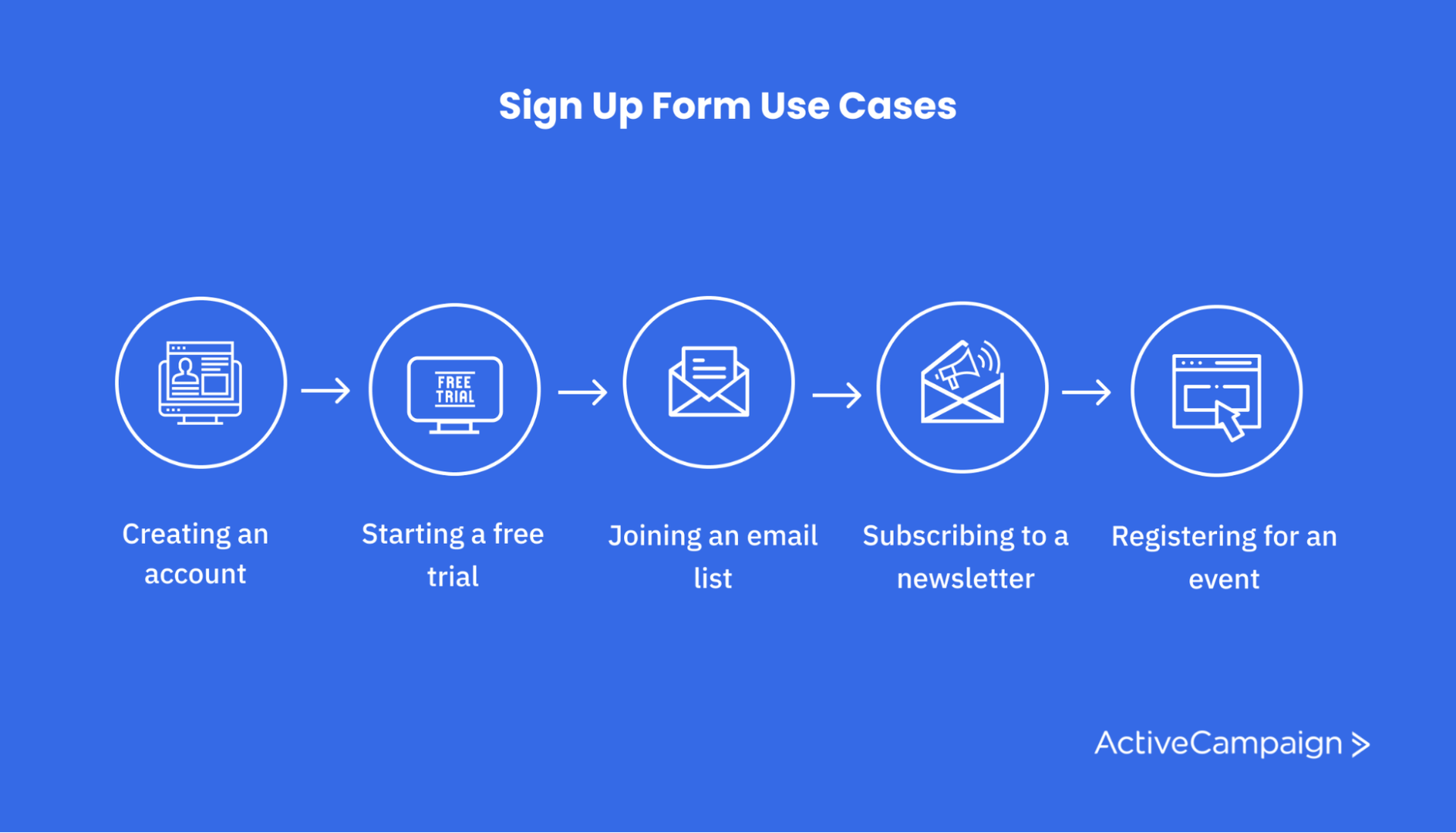
Often, sign-up forms build email and contact lists for newsletters, send deal and discount alerts, or perform other lead-generating activities. You might also use a sign-up form for event registration.
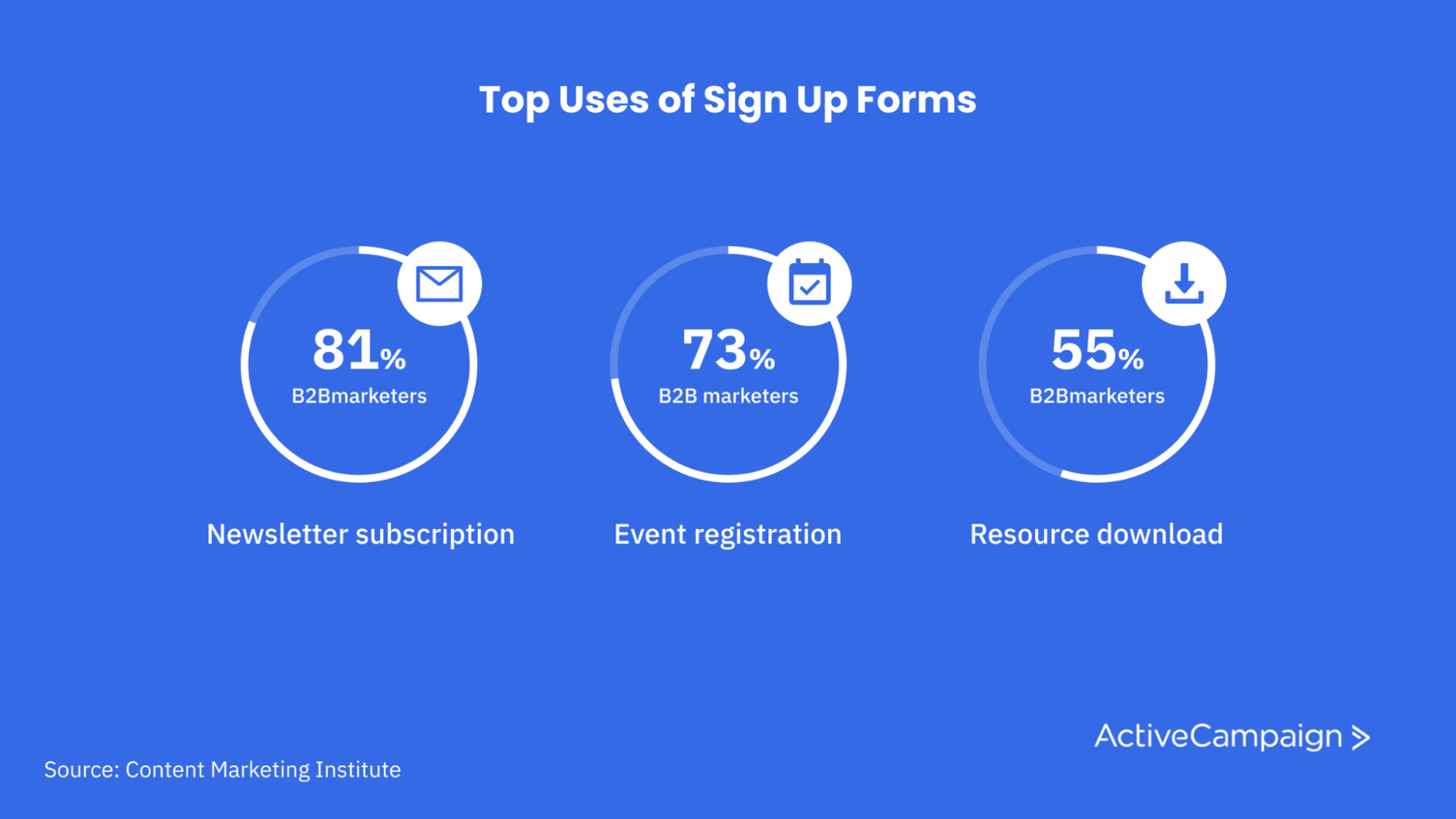
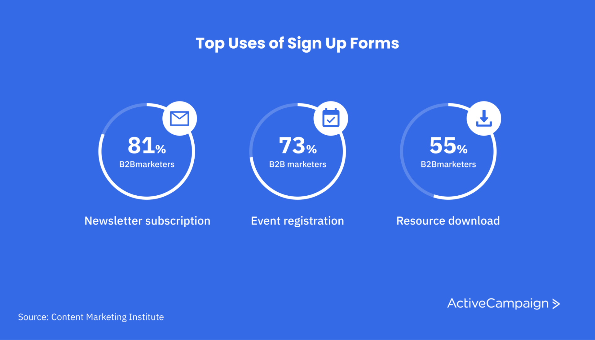
Considering that 81% of B2B marketers use email newsletters (pdf) in their content strategy, chances are you’ll need a sign-up form to interact with your customers at some point.
Creating sign-up forms might seem like a simple process, but it’s important to be strategic in your design. A poorly designed sign-up form can cause visitors to bounce from your website, meaning you lose a potential lead or sale.
As you design your sign-up form, whether from a form template or a custom design, remember that your goal is to create a frictionless experience. The easier the sign-up process is for your customers, the more signups you’ll get.
How to create a sign-up form
There are many factors to consider, especially if you’re looking to follow best practices.
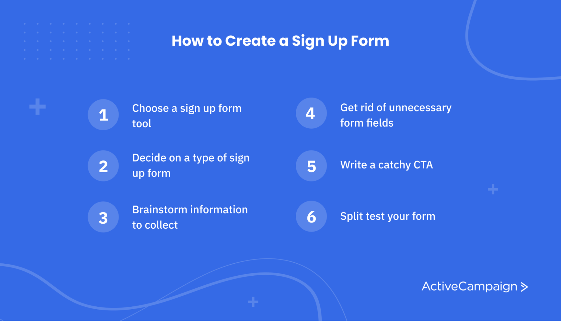
We’ll cover best practices later on, but right now, let’s look at how to create an optimized sign-up form in just six steps.
1. Choose your method or tool
A common way to create sign-up forms is to use email marketing software like ActiveCampaign that features sign-up form templates and customization options.
In fact, up to 85% of B2B companies use email marketing software to help with lead generation, content marketing, and, you guessed it — sign-up forms.
These platforms allow you to create embedded forms right on your website, as well as other sign-up form options like an exit intent pop-up.
Implementing a sign-up form via HTML or other hand-coded approaches is also possible, but a sign-up form tool will make the process much easier for you and your team to manage.
2. Decide what type of sign-up form you’ll use
Think about the purpose of your sign-up form. Will it be a newsletter sign-up form? An email list subscription form? An event registration form?
The purpose of your form will impact both the length and the layout of your form design. For instance, if you’re trying to grow your email contact list, a simple sign-up form in a floating bar or a pop-up form might be good options.
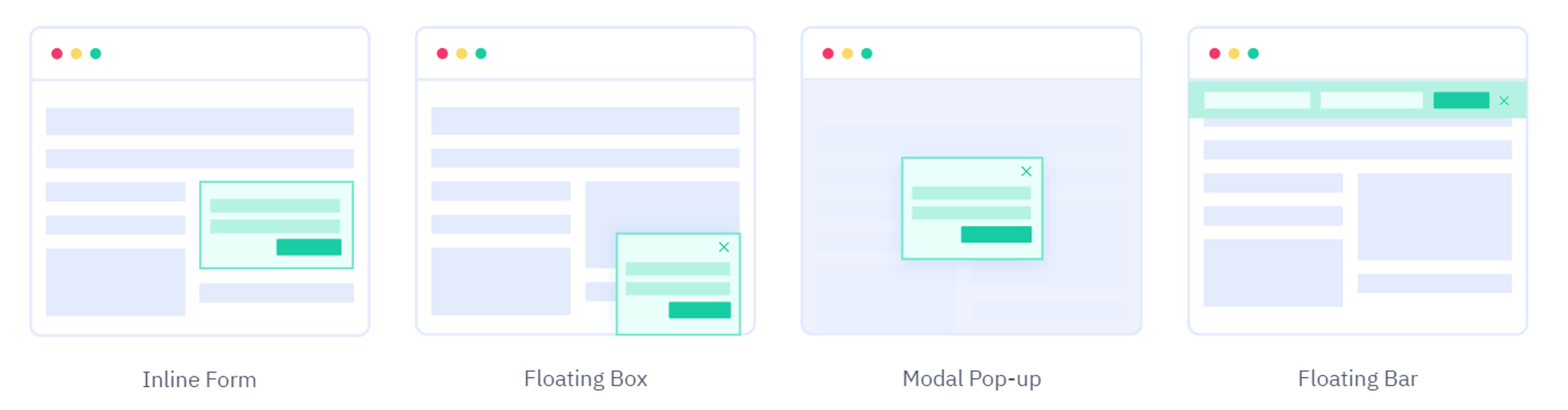
But if you’re creating an event registration form, you’ll likely need more information from users. In this case, you may want to choose an inline form or sidebar.
3. List the information you’d like to collect from users
Think about what information you’d like to collect from new subscribers. Names and email addresses are nearly always going to be a must, but there is plenty of other customer information you can collect too.
For instance, you might want to know a lead’s industry or company size to help you personalize content and develop marketing and sales strategies that will close more deals.
Be strategic in what information you want to gather. Each form field you add to your form design should have a clear business purpose, such as customer segmentation or lead nurturing, that helps you meet your goals.
4. Eliminate unnecessary fields
In today’s data-driven business climate, it’s easy to go overboard and ask new subscribers for tons of information that can help you build your marketing and sales strategies.
But as we mentioned earlier, long, complicated forms can cause users to leave your website without completing the form.
To reduce the amount of information you ask users to input, look at the list you created in the previous step. Get rid of anything redundant or otherwise unnecessary.
For example, while a user’s location might be useful to your business strategy, you might only need their city or zip code rather than a full street address.
Keep in mind that a sign-up form is just the start of your relationships with new subscribers. You’ll be able to learn more about them as they move through the sales cycle.
5. Write a catchy CTA
The call-to-action button is a critical element of your sign-up form.
The call-to-action, or CTA, is that last bit of encouragement that turns users into subscribers. The placeholder text for a CTA button in a form template usually just says “Submit.” That’s not the most exciting button you could hit.
A good CTA button will be short, unique, and remind users why they should complete your sign-up form.
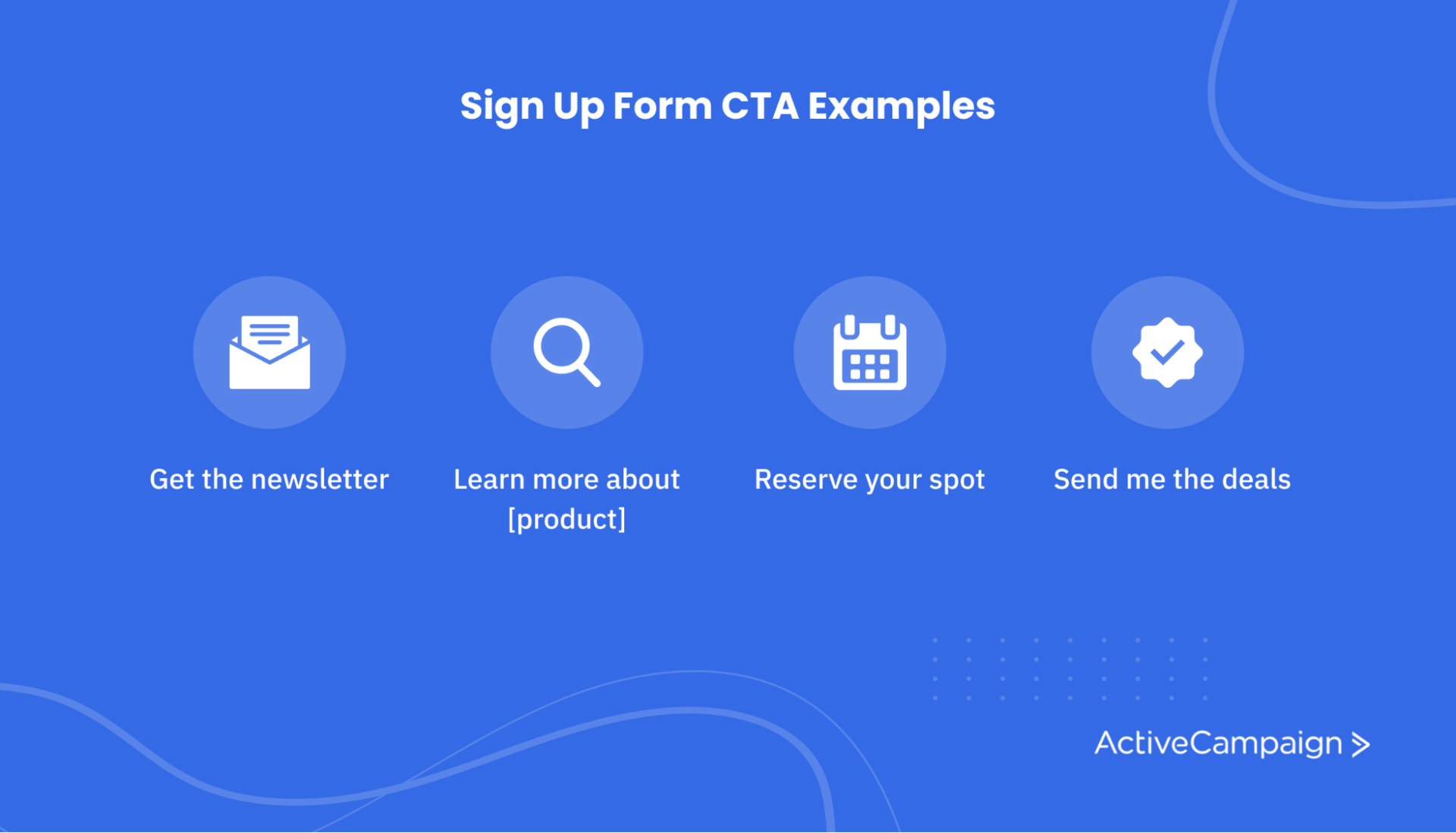
Here are some examples of good sign-up form CTAs:
- Get the newsletter
- Learn more about [product]
- Talk to an [industry] expert now
- Reserve your spot
- Send me the deals
6. A/B test your sign-up form
A/B testing, or split testing, is an effective strategy for sign-up form optimization. In this approach, you’ll present two versions of your form to similar segments of your audience to see which one performs better.
When split testing your CTA, landing page, or other components of your sign-up form, be sure you only test one feature at a time. This way, you’ll hone in on exactly what elements of your form design are working for users and which aren’t.
If you’re using email marketing software or a similar tool, you’ll usually have access to A/B testing tools that can help you design the right test for your sign-up form optimization.
Ready to turn all those new signups into customers (on autopilot)?
4 sign-up form best practices for increasing conversions
Ready to learn the best approach for sign-up form design and optimization? Take a look at these sign-up form best practices.
1. Keep it short and simple
The longer your form, the less likely visitors are to complete it. That means you shouldn’t ask for more information than you need.
Think about where else you can get the data you want. For example, if you have a subscriber’s zip code, you can learn their city and state, so there’s no need to have all three fields.
A great way to make a simple sign-up form is to use social media accounts like LinkedIn, Facebook, or Google. Your website developer can implement the social sign-in components through the tools provided by these platforms. This approach makes it easy for users to sign up and typically provides more accurate information..
2. Make the benefits obvious
Users want to know why they should fill out your sign-up form, so you need to make signing up worth it.
Decide what you will offer your subscribers. Will they get deals and discounts? Industry-related content? A free product trial? Be clear on your website about the benefits of signing up.
Don’t forget to highlight special features and other factors that will persuade visitors to become subscribers.
You always need a concrete incentive for your sign-up form. Whatever your offer, make sure it’s clear and enticing.
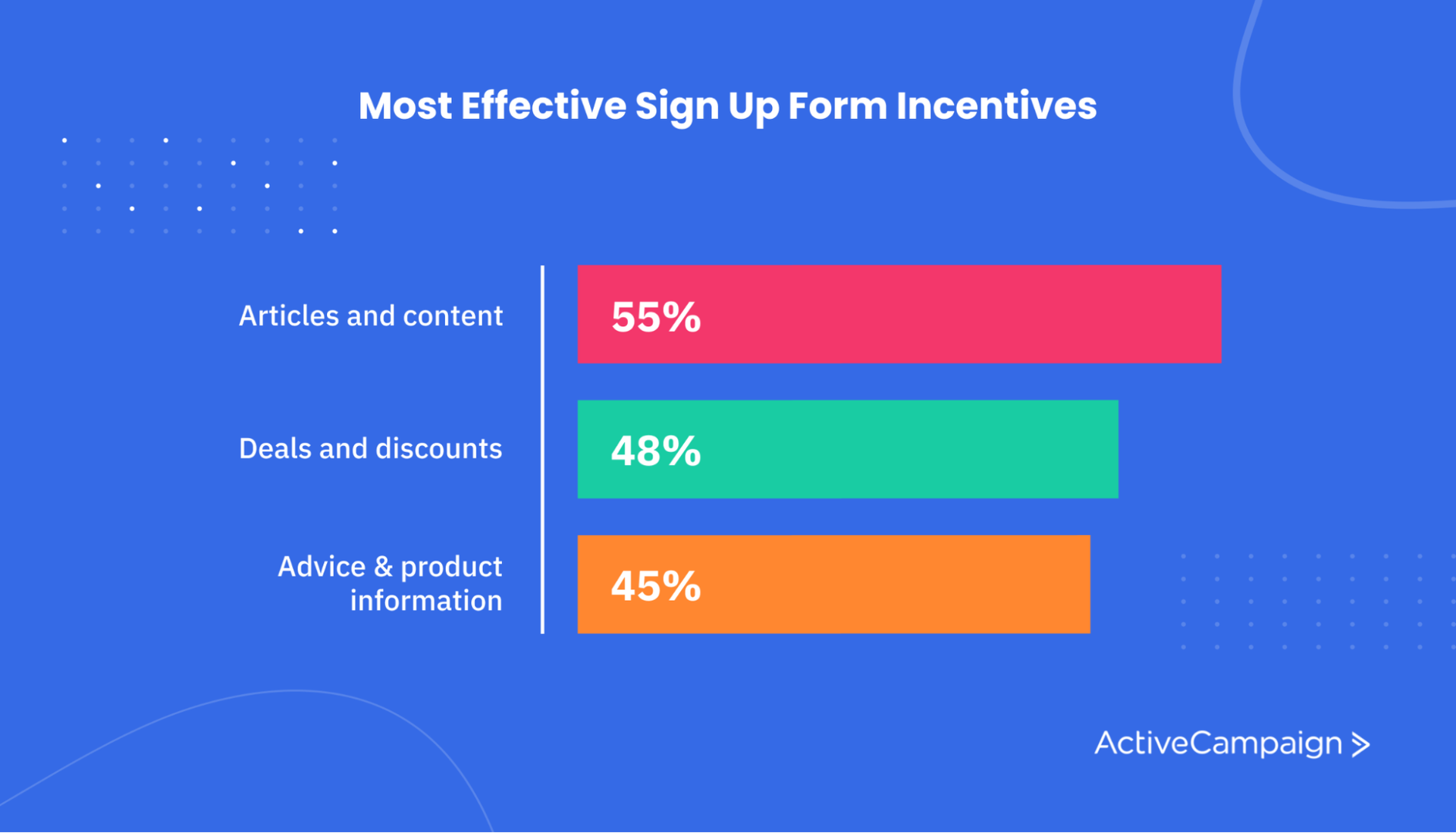
Here are a few sign-up form incentives marketers have found to be effective approaches:
- 55% of B2B marketers found articles and content to be most effective in moving leads through the sales funnel
- 48% of UK marketers found email deals effective
- 45% of marketers found providing advice and information effective
3. Tell visitors how often you’ll contact them
Online visitors may be wary of filling out online forms that will lead to dozens of spam calls and emails.
You can mitigate these concerns by giving users control over how often they hear from you or outline when they can expect an email from you.
Offer users the option to choose the kinds of communication they’ll receive from you and honor their wishes.
4. Design for mobile-first
More than half of all web traffic — 54% — takes place on mobile, so everything about your form needs to work on smartphones.
Use responsive design and keep forms short and simple, so they work well across devices. Aim to offer the same sign-up form experience to all users, regardless of the device they use.
Since many countries have high levels of mobile internet usage — with 94% and 83% of consumers in the U.S. and UK surfing the web on the go — mobile-friendly form design is an absolute must.
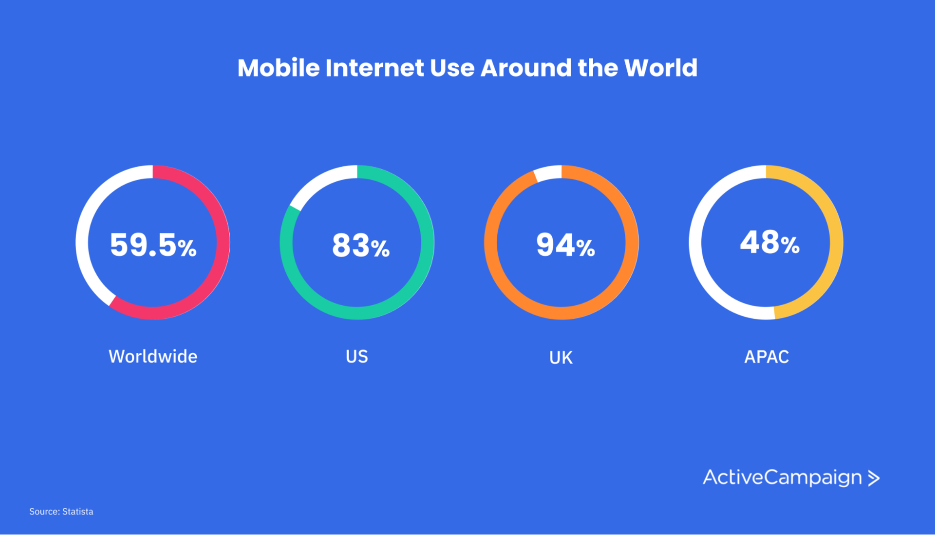
Even in regions like APAC where just 48% of consumers use mobile internet, the spread of smartphones continues to grow.
3 great sign-up form examples
What do all our sign-up form optimization tips mean in practice? Let’s take a look at some sign-up form examples to inspire your next web form.
1. Intuit
Intuit’s account registration form is the epitome of making it easier for your customers. Instead of filling out a new sign-up form for each Intuit product, you’ll just complete one form one time.
That makes it more likely that someone who signs up for one product will eventually buy another. It’s one less step to a new sale for the business and the customer.
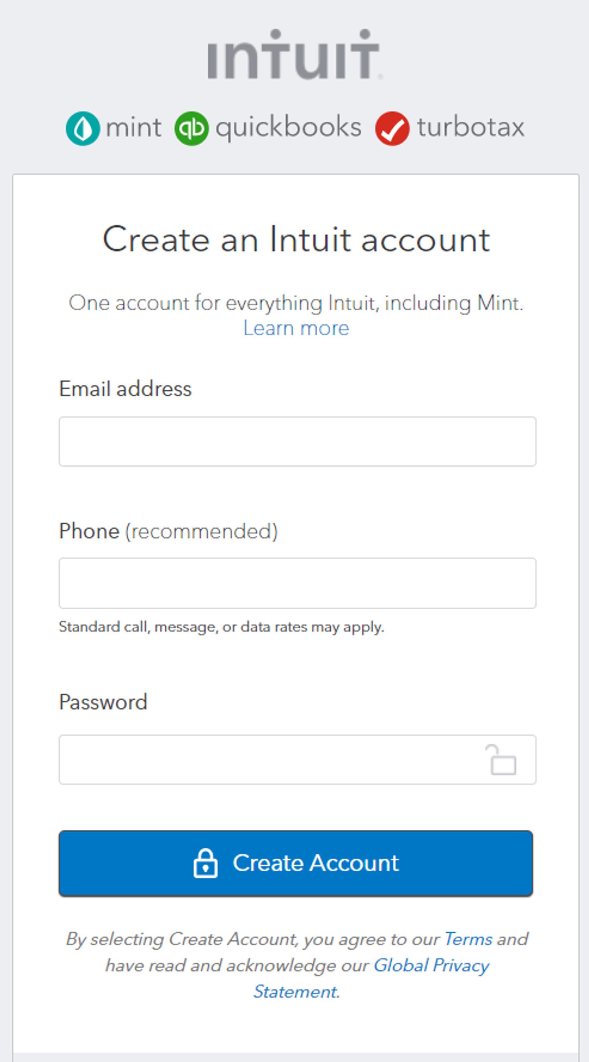
What we like about this sign-up form:
- There are just three form fields
- It’s mobile-friendly
- You just need one sign-up across all Intuit products
2. Postman
Like Intuit, Postman keeps its sign-up form short. At the same time, it includes more information about why users should create a Postman account.
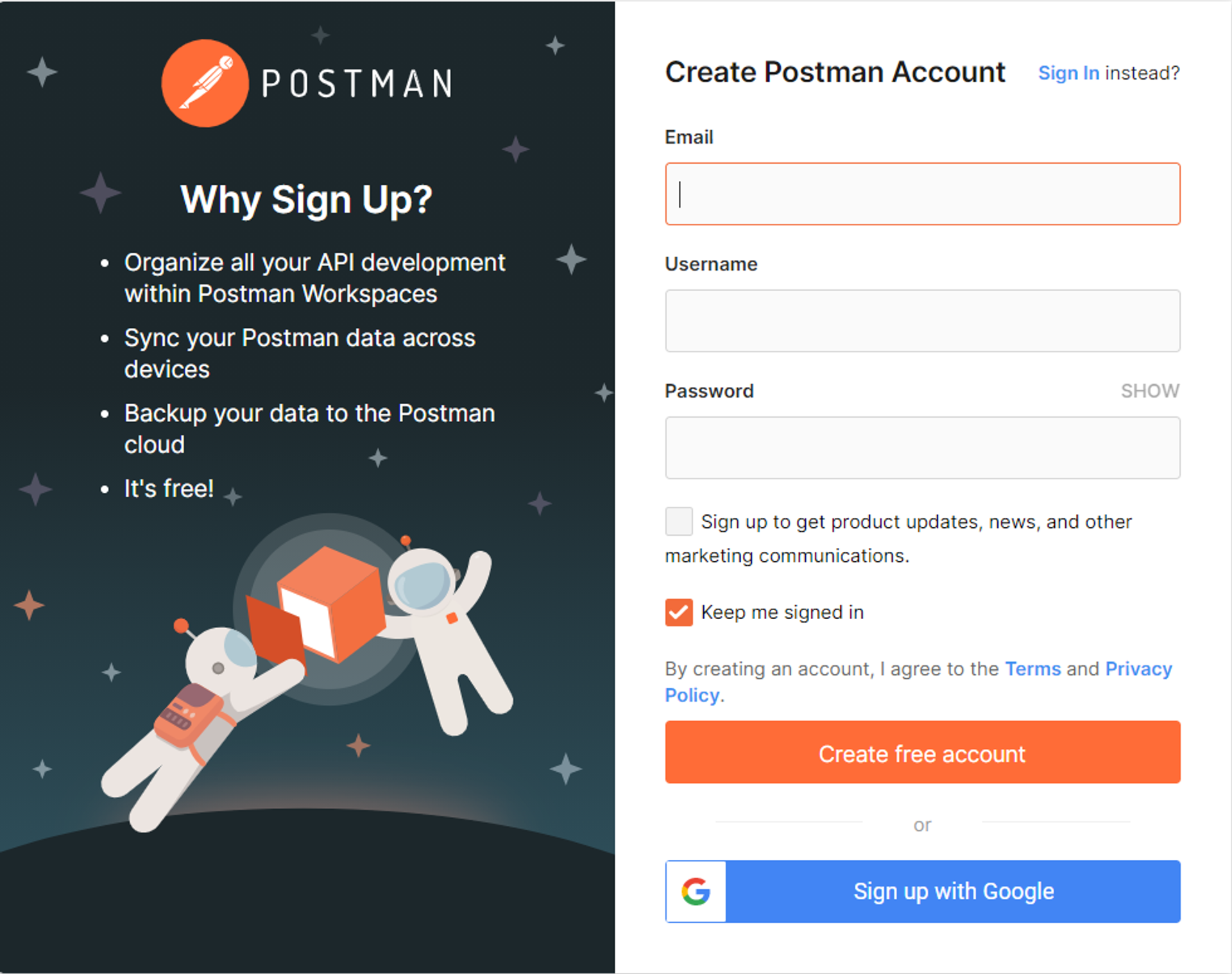
What we like about this sign-up form:
- It’s short and simple
- It’s spruced up with fun graphics
- There’s a social sign-up option
- The landing page copy includes a brief list of benefits
3. ActiveCampaign
When we created our own sign-up form for a free trial, we wanted to make it as easy as possible to sign-up. That’s why there’s just one field to fill out.
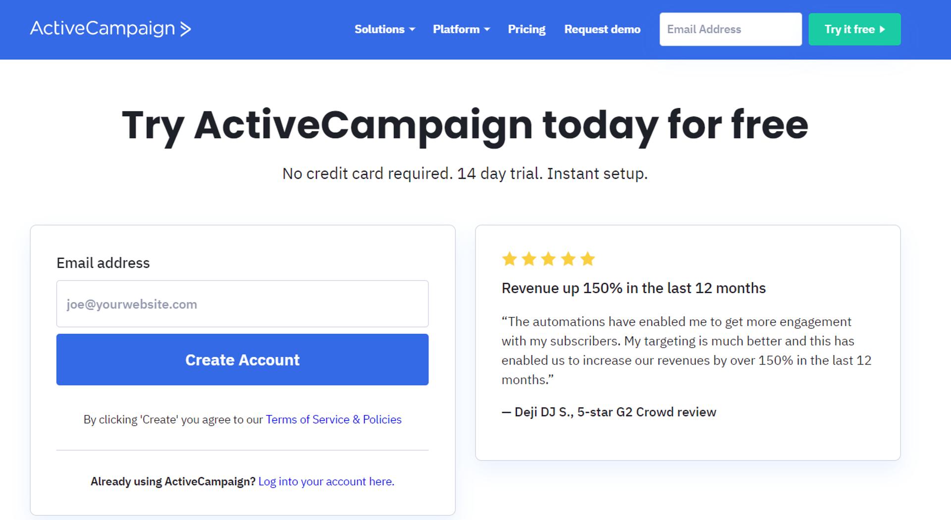
What we like about this sign-up form:
- It’s super short, with just one form field
- It includes social proof with a detailed testimonial
- It emphasizes that users can start using the product right now, eliminating the need for a credit card number or other lengthy information
But seriously, here’s another signup form.
Boost sign-up form conversions today
A well-design sign-up form can do wonders to increase conversions, whether you’re building an email subscriber list, registering event attendees, or generating leads.
By keeping your email sign-up forms short, you’ll make it easy for customers to provide you with valuable information that helps grow your business.
For sign-up form templates and other tools to help your sign-up forms work better, talk to an expert at ActiveCampaign.