Newsletter design best practices come down to eight rules. Give each issue one job, keep the look consistent, and write the subject line and preheader as part of the design. Use live text, readable type, and images that earn their space. Keep the issue lean and end with a footer readers trust.
This page is the checklist. Each rule comes with the mistake it prevents and a quick way to check it. For layouts, template picks, and 10 newsletter types, read ActiveCampaign's newsletter design guide.
What are the best practices for newsletter design?
Good newsletter design follows eight rules, and each rule prevents a specific mistake. Use this table as a quick reference, then read the rule that matches your weak spot.
Newsletter design checklist at a glance
| Rule | Mistake it prevents | Quick check |
|---|---|---|
| 1. Give each issue one job | Several buttons with equal weight | Name the one action in a sentence |
| 2. Keep the look consistent | A redesign with every send | Line up your last three issues |
| 3. Design the subject line and preheader | Preview text that reads "View in browser" | Read the inbox preview on your phone |
| 4. Use live text | Offers inside images that block | Turn images off and reread |
| 5. Make the type readable | Small, low-contrast gray text | Check a 4.5:1 contrast ratio |
| 6. Choose images with a job | Generic stock photos and heavy files | Ask what each image shows |
| 7. Keep the issue lean | One long scroll that gets clipped | Scroll it on a phone and cut a section |
| 8. End with a trusted footer | A hidden unsubscribe link | Find the unsubscribe link in five seconds |
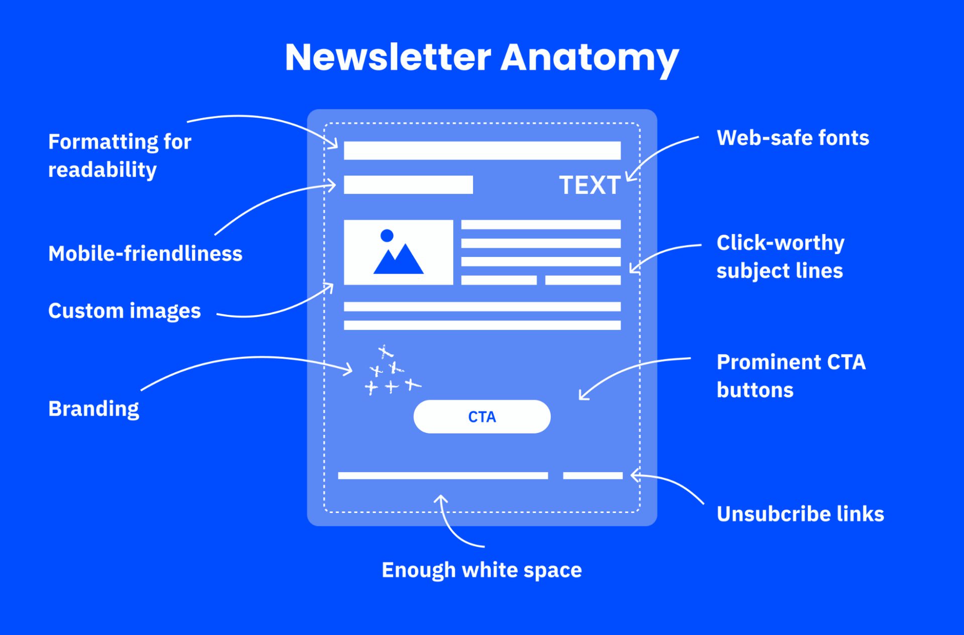
8 newsletter design best practices and the mistakes they prevent
1. Give each issue one job
Choose one action for the issue and make everything else support it. The common mistake is giving a webinar invite, a blog link, and a discount code equal weight, so readers pick none.
Write the goal as one sentence before you open a template, such as "Get readers to register for Thursday's webinar." If an element does not serve that sentence, move it lower or cut it. A single-column layout keeps the path to the main button short, and the newsletter design guide shows layouts that do this well.

2. Keep the look consistent from issue to issue
Readers recognize a familiar newsletter before they read a word. The common mistake is changing colors, fonts, or header layout with each send. The email then feels like it comes from a different sender every time.
Lock these five elements and reuse them:
- Logo size and position
- Two or three brand colors
- One heading font and one body font
- Button shape and color
- Footer layout
Line up your last three issues. They should look like siblings.
3. Design the subject line and preheader with the email
The inbox preview is the first screen of your design. The common mistake is leaving the preheader empty, so the preview shows "View in browser" or the first line of the header.
Write a subject line that names what the reader gets, then use the preheader to add one detail the subject line left out. Check both in a phone preview before you send. ActiveCampaign's guides to the email preheader and A/B testing subject lines show how, and the subject line generator drafts options you can edit.
4. Put the message in live text
Live text is text that readers can select and screen readers can read. Many email apps block images until the reader allows them. An offer or button built as a picture can then show up as an empty box.
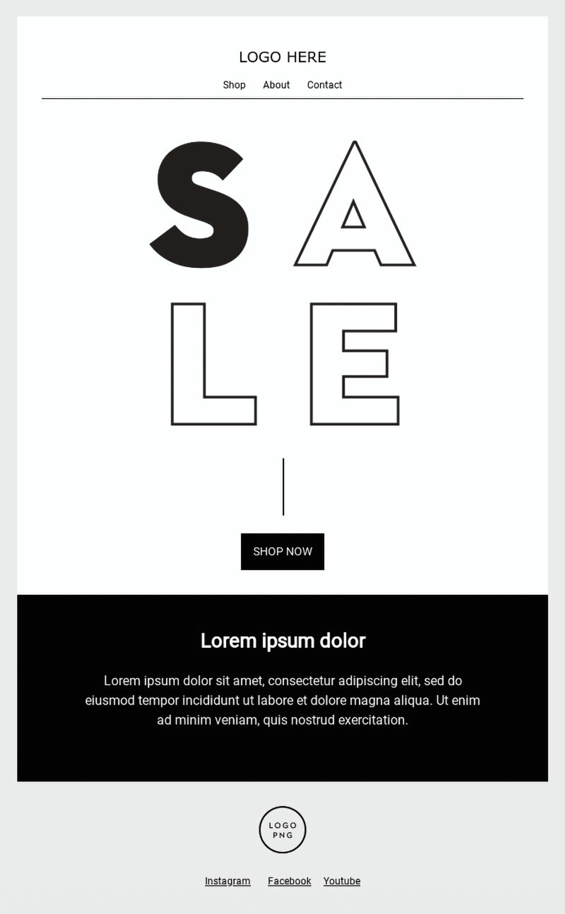
Build headlines, offers, and buttons as text. Write alt text for every image that carries meaning, and leave alt text empty for purely decorative images. To check, turn images off in a test send and confirm the email still makes sense.
5. Make the type easy to read
Set body text at a size readers can read on a phone without zooming, and keep lines short. The common mistake is light gray text on a white background.
The W3C's WCAG success criterion 1.4.3 asks for a contrast ratio of at least 4.5:1 for body text. Choose one or two web-safe fonts so the email looks the same in most inboxes. A bold headline font works when the body font stays plain.
6. Choose images that earn their space
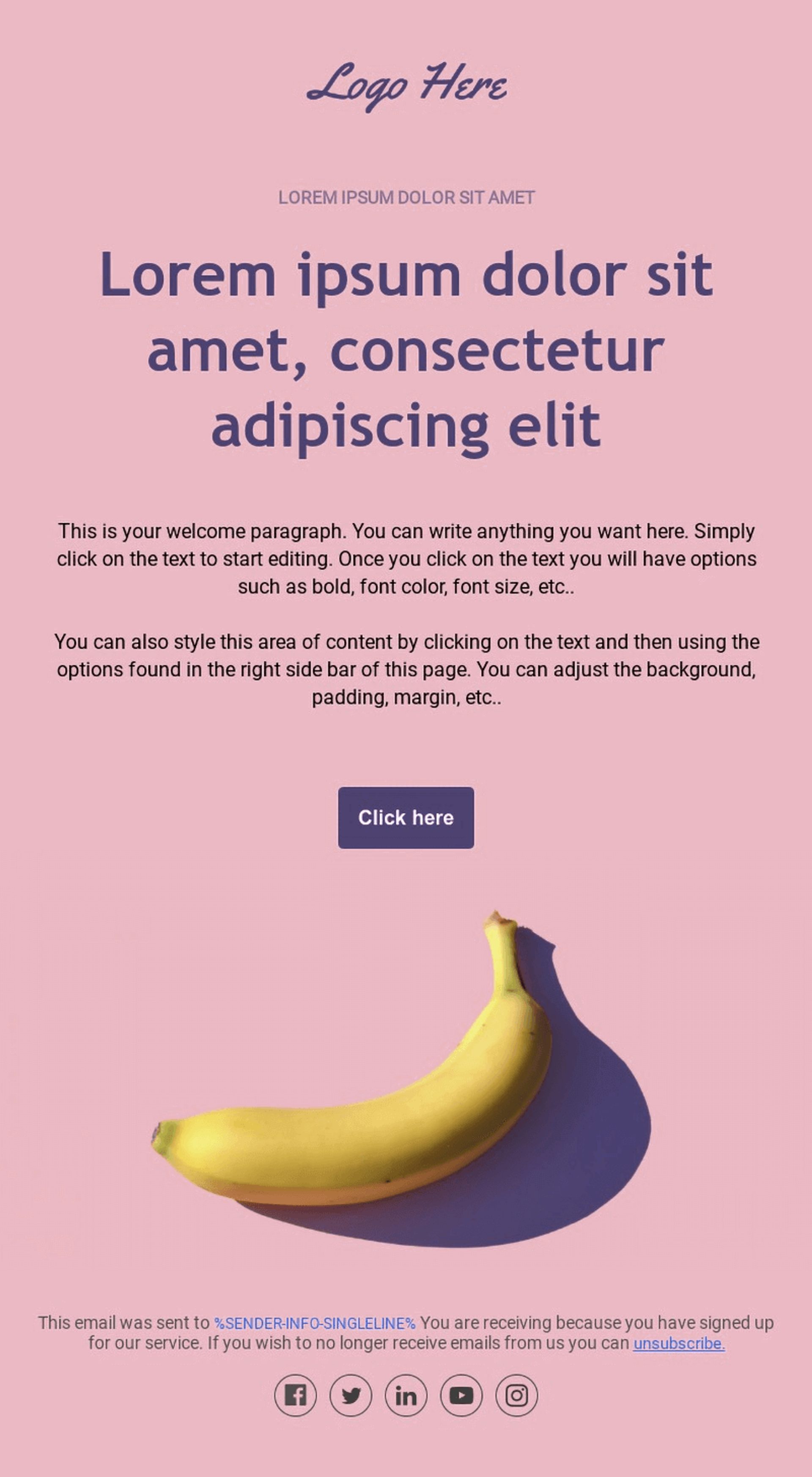
Every image should show something the copy cannot: the product, the person, or the place. The common mistake is a generic stock photo readers have seen before.
Use these image habits to keep the email credible:
- Use your own photos, and edit them with the same preset so they look related.
- Add a headshot beside a customer quote, with the customer's permission.
- Show a clear product photo with one button, and send readers to your site for the details.
- Compress files so the email loads quickly.
Photos from real customers also build trust. Ask permission before you feature them.
7. Keep the issue lean
Short issues get finished. The common mistake is stacking every update into one long scroll. Gmail can also clip a long email behind a "View entire message" link.
Lead with the most useful item, summarize the rest in two sentences each, and link to your site for the full story. If a section would not earn a click, cut it.
8. End with a footer readers trust
A good footer has a visible unsubscribe link, your sender name, and your postal address. In the US, CAN-SPAM requires the opt-out and the address. The common mistake is hiding or graying out the unsubscribe link, which sends frustrated readers to the spam button.
An easy exit protects your sender reputation. Read ActiveCampaign's guides to the unsubscribe message and to how engagement affects deliverability for the details.
How do you test a newsletter design before you send it?
Run these six checks before every send:
- Send a test to yourself and open it on a phone and a laptop.
- Read the sender name, subject line, and preheader as the inbox shows them.
- Turn images off and confirm the headline and main button still show.
- Switch your phone to dark mode and check the logo and text.
- Click every link, including the unsubscribe link.
- Squint at the preview and confirm the headline and main button stand out.
After the send, compare clicks on the main button with the goal you wrote. Change one design element at a time so you know what moved the result.
Pro tip
Keep a short design note in your template with your hex colors, font names, and logo size. Whoever builds the next issue starts from the same rules.
How ActiveCampaign helps you keep newsletter design consistent
Consistency is the hardest rule to keep when several people build issues. ActiveCampaign is an AI platform for marketers, with Active Intelligence built into every plan, and its design tools start with your brand.
The AI Brand Kit imports your logo, fonts, and colors from your website address, so every new email starts on brand. In the email designer, you set the message width, choose a layout with one to four columns, hide elements on mobile, and preview desktop and mobile before you send.
Start from an email template, apply your Brand Kit, and edit the copy. Active Intelligence drafts copy from your brief, and you approve every send, so the newsletter keeps your voice and your standards.
Design your next newsletter in ActiveCampaign
Newsletter design FAQ
What makes a good newsletter design?
A good newsletter design gives readers one clear action, stays consistent from issue to issue, and works on a phone with images off. Readable type, images that carry meaning, and an easy unsubscribe link complete the basics.
What are the most common newsletter design mistakes?
The most common mistakes are equal-weight buttons, offers built inside images, low-contrast gray text, a hidden unsubscribe link, and a new look with every send. The checklist table above pairs each one with a fix. ActiveCampaign's bad newsletter examples show them in real emails.
How do you test a newsletter before you send it?
Send a test to yourself and check it on a phone and a laptop, with images off, and in dark mode. Click every link, including the unsubscribe link, and confirm the main button is easy to find.
Where can you find newsletter layouts and templates?
The newsletter design guide covers layouts and 10 newsletter types, with a template for each. You can also browse ActiveCampaign's email templates and edit any of them in the email designer.