- People don’t understand what you can give them (so why would they sign up?)
- Your offer is less interesting than plain white rice that is somehow also beige
- They never even notice your offer in the first place
- Scenario One: Your website gets 1000 visitors a week, with a conversion rate of 0.5%. That’s 5 subscribers per week. If you know you can convert 10% of your subscribers into customers, that’s 1 new customer every two weeks.
- Scenario Two: Your website gets 1000 visitors a week, with a conversion rate of 2%. That’s 20 subscribers per week. If you know you can convert 10% of your subscribers into customers, that’s 2 new customers every week.
- The first, crucial step to more conversions (if you don’t do this, nothing else matters)
- Why your writing is driving people away…and a 5-minute technique to fix it
- How to make your copy clearer than a freshly-cleaned magnifying glass looking at Lake Clarity
- Why benefits > features, except when features > benefits
- How to get the best copywriters in the world to write for you (for free)
Wait, first things first. Can people even find your opt-in form?
In 24 hours, my blog post sucked in 42,000 visitors. I had gone viral on Reddit, and I physically shook with excitement. Until the dust cleared and I saw how many people converted. How many do you think signed up? 42,000? 4,000? 400? It was 4. That’s a conversion rate of 0.009%. I could increase that conversion rate by 1000% and still have an email list under 100 people. I’d broken the first rule of how to get people to opt in to your online form. In an article about how to improve email sign-up forms, Andy Crestodina lays out three key factors:- Prominence
- Promise
- Proof
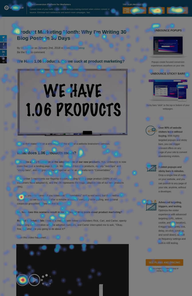 “Out of 1,481 (desktop) visitors and 3,428 clicks, only 3 people (0.09%) clicked the sidebar CTA. More people clicked on the statement beneath the button than on the button itself.” – Oli Gardner, Unbounce
“In my research and experimentation at Unbounce – and looking at some of our customer landing page data – I’ve found two really interesting things about lead gen forms and conversion rates.
For years marketers and designers have been trained to think that anything important, such as your call to action (button or form), should be placed above the fold – primarily based on old studies and bygone behavioral analysis that says people don’t scroll. This is often no longer the case, and at Unbounce we’ve seen that placing your CTA below the fold, or even at the bottom of the page, can encourage people to scroll and hunt for the interaction point.
We’ve also seen data that suggests that on lead gen landing pages, forms placed approximately 670px from the top of the page (on average) can have a positive impact on conversion rates.
Another interesting behavioral insight can come from the simple act of changing the email address form field label. Sometimes people pay close attention to what they are being asked to do – whether they are tired, or just like clear instructions. In an experiment I’ve run several times, I’ve seen that by changing the field label to “Work Email Address” or “Business Email Address” you can collect more company branded emails (such as name@companyname.com as opposed to name@gmail.com).
The benefit to this is that when you are doing subsequent email marketing, your communications are going to their work inbox, often during work hours, when they’re making business decisions. A simple, yet powerful hack.”
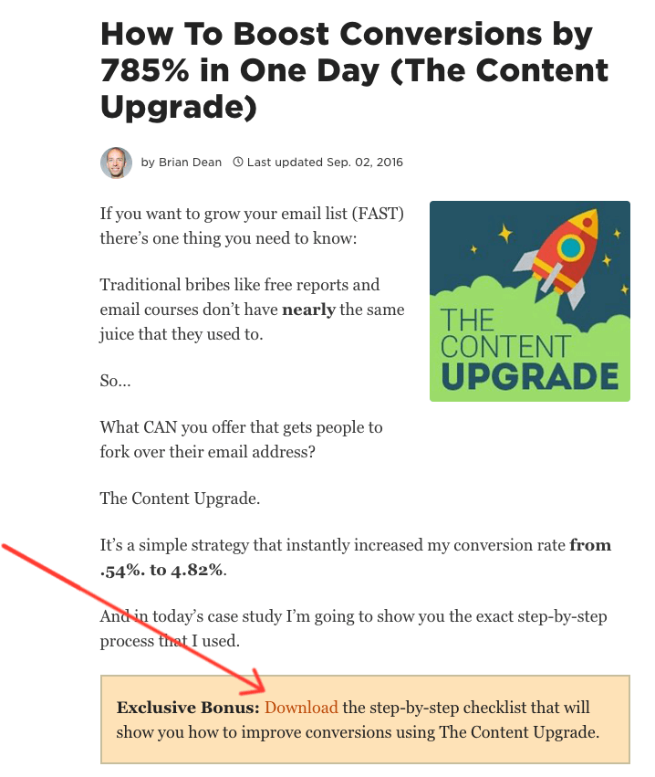 This blog post about content upgrades…has a content upgrade
- Modal
- Pop-up
- Popover
- Flash notice
- Growl notification
- Theatres
- Tooltip
- Hovercard
- Widget
- Lightbox
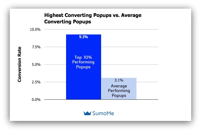
Pop-ups work. This chart comes from the Sumo research.
If I’d had an average-performing pop-up for my 42,000 visitors, I’d have picked up a cool 1,302 subscribers—instead of, ya know, 4. If the idea of pop-ups makes you nervous, remember that there are a few ways you can make pop-ups less annoying—without losing their effectiveness:- Show pop-ups on scroll. Only show the pop-up after your visitors have scrolled a certain percentage of the way down the page.
- Show pop-ups after a set amount of time. Only show the pop-up after 10 seconds, 30 seconds, 60 seconds, or a time you specify.
- Show pop-ups on exit intent. Exit-intent pop-ups only trigger when a visitor goes to leave the page.
Expert insight: Andy Crestodina on form prominence
 There are a lot of ways to make your signup form prominent. Some:
- The popup …couldn’t be more prominent. It forces the visitor to deal with it
- The sticky header or footer …it stays in their field of vision
- The in-line CTA …injected into the content, it’s in the flow so they can’t miss it
- Large elements
- High on the page
- Contrasting color
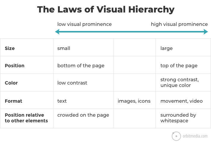
You can see this chart (and 27 other web design tips) on Orbit Media’s site
Forget what you know about writing. It’s driving people away (and here’s how to fix it in 5 minutes).
“Most businesses get this horrendously wrong because they don’t consider what readers want to get out of the experience. Instead, they focus on trying to sound professional, experienced or knowledgeable – and it almost always backfires.
They “leverage” this, “synergize” that, and offer “integrated, innovative solutions” for just about everything else. They use words that no one ever says out loud, come across as stiff and wooden in the process, and have a remarkable knack for saying nothing of interest about anything.” – Mish Slade, writing in May I Have Your Attention Please
Have you ever noticed how hard it is to write about yourself? Even if you’re usually a pretty good writer, stuff gets tricky when you sit down to write…- A cover letter
- A personal statement or *shudder* college application essay
- A Tinder bio
- Opt-in copy for your website
“The very first thing I tell my new students on the first day of a workshop is that good writing is about telling the truth.” – Anne Lamott, writing in Bird by Bird
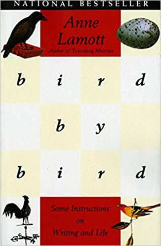
One of the classic books about writing (Amazon)
No, I’m not calling you a liar. Instead, I’m asking a question… If you had to stand next to someone, face-to-face, and convince them to sign up for your email list (or download your lead magnet), how would you do it? Here’s your 5-minute technique to writing opt-in copy that doesn’t suck. Actually, it’s two techniques—you can pick one:- Write, stream of consciousness, about the benefits of your email list. Don’t stop to think. Don’t hit backspace. Just type as fast as you can, as though you were writing a letter to your friend.
- Talk as though you were telling a friend about your newsletter. Record it on your phone (the Voice Memos app is free on iPhones).
Be clear. Not clever. Clarity beats cleverness. If there’s one most important thing, it’s clarity.
“When you write a headline, get attention by picking out an important customer benefit and presenting it in a clear, bold, dramatic fashion. Avoid headlines and concepts that are cute, clever, and titillating but irrelevant. They may generate some hoopla, but they do not sell.” – Robert Bly, writing in The Copywriter’s Handbook
Puns do not get clicks. Puns do not get downloads. Puns do not get subscribers. Now I loooooooove a good pun. When I whip out a joke like “plateaus are the highest form of flattery,” I crave the collective groan of the entire world (or at least the room). But not in your opt-in copy. At least, not in the headline. When you’re trying to get someone to give you their email address, you have seconds. In those seconds, you need to…- Get them to notice your offer
- Get them to want your offer
- Get them to accept your offer
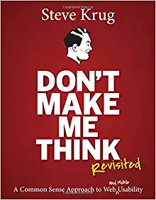 There’s a reason this is like the bible of web design (Amazon)
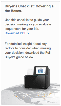 “Covering all the bases” is a DNA pun. But it makes people think, so conversions will be DNA NONE (…sorry).
 Everyone can understand this. It’s simple, direct, and compelling.
- Your guide to the top 19 DNA sequencers
- Which DNA sequencer is the best for your lab?
- This guide compares the top DNA sequencers so you don’t have to
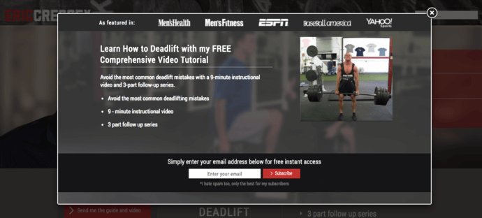 9-minute video, 3-part series. Learn how to deadlift. Got it.
- There’s a video
- It’s about deadlifting
“Ad writers abandon their parts. They forget they are salesmen and try to be performers. Instead of sales, they seek applause.” – Claude Hopkins, writing in Scientific Advertising
To make sure your message is clear:- State the benefit it gives your visitor
- Describe, plainly, what it actually is
Benefits beat features, except when features beat benefits
“A complete description of your product including how many pages, how many words, how many photos, who wrote it, facts about the author (his age, background, success stories, etc.). You should also take notes on what this product will do for you.” – Gary Halbert, describing his research process in The Boron Letters
If you read articles like this one, you’ll probably get the advice “sell based on benefits instead of features.” Sometimes people prefer to say it as “sell the sizzle, not the steak.” Do a little googling and you’ll find some pretty interesting “origin stories” for this ole sayin’. Yeah…I don’t think this is right
- The beneficial outcome they’re going to get
- What you are actually giving them!
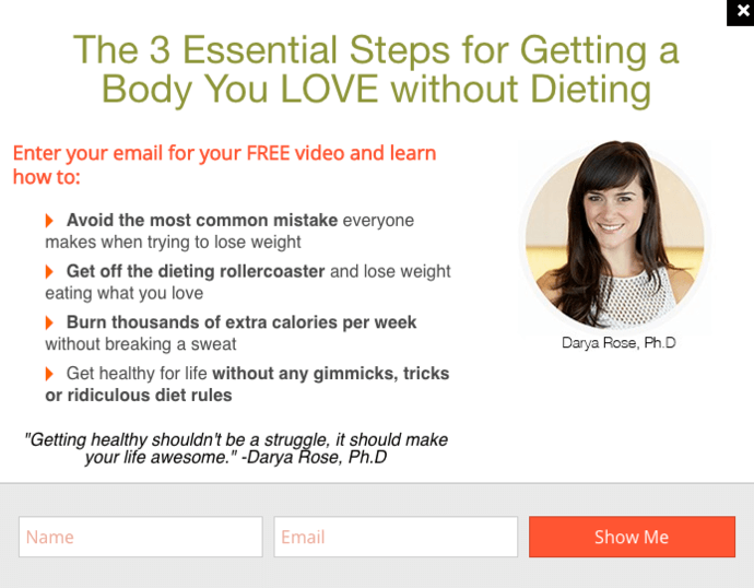 Clear, compelling, credible benefits.
- It promises a benefit that isn’t generic (a body you love without dieting)
- It uses powerfully emotional language (“get off the dieting rollercoaster”)
- It adds credibility (emphasizing Darya’s PhD)
- It sounds easy (only 3 steps, “getting healthy shouldn’t be a struggle”)
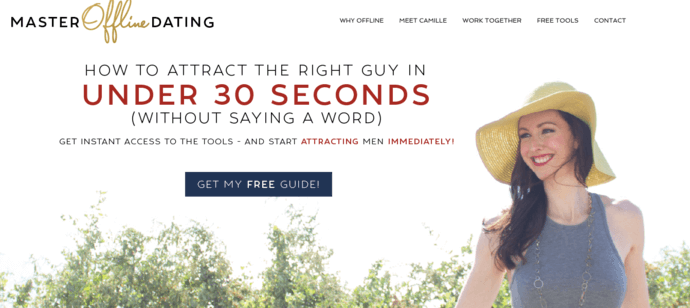
 What exactly does this company do?
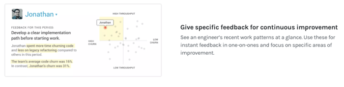 Now I know exactly how to help Jonathan
“The weight of an argument may often be multiplied by making it specific. Say that a tungsten lamp gives more light than a carbon and you leave some doubt. Say it gives three and one-third times the light and people realize that you have made tests and comparisons.” – Claude Hopkins, writing in Scientific Advertising
Sometimes, the benefit of a feature is self-evident. In Hopkins’ example, you don’t need to tell people that more light is better than less light. They can infer that by the specific, persuasive detail you’ve given them. Here’s a quick example from CopyHackers. It’s short, but it does a good job of showcasing these ideas.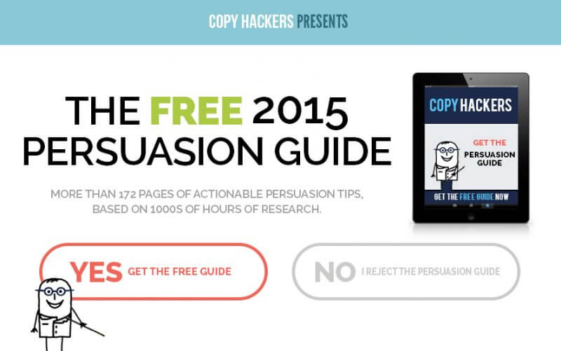 I do not reject the persuasion guide
Outsource your copywriting to the best writers in the world (for free)
“There is your audience. There is the language. There are the words that they use.” – Eugene Schwartz, writing in Breakthrough Advertising
I won’t hold you in suspense. The best writers in the world are your customers. The problem with so much marketing writing is that someone tried to write it. As I mentioned earlier, boring, vague copy comes from people who are trying to sound persuasive—but don’t really know how to be persuasive. Instead of writing copy for yourself, take the literal words that your customers use. Check out this copywriting example, from the recently revamped CRM page on our website.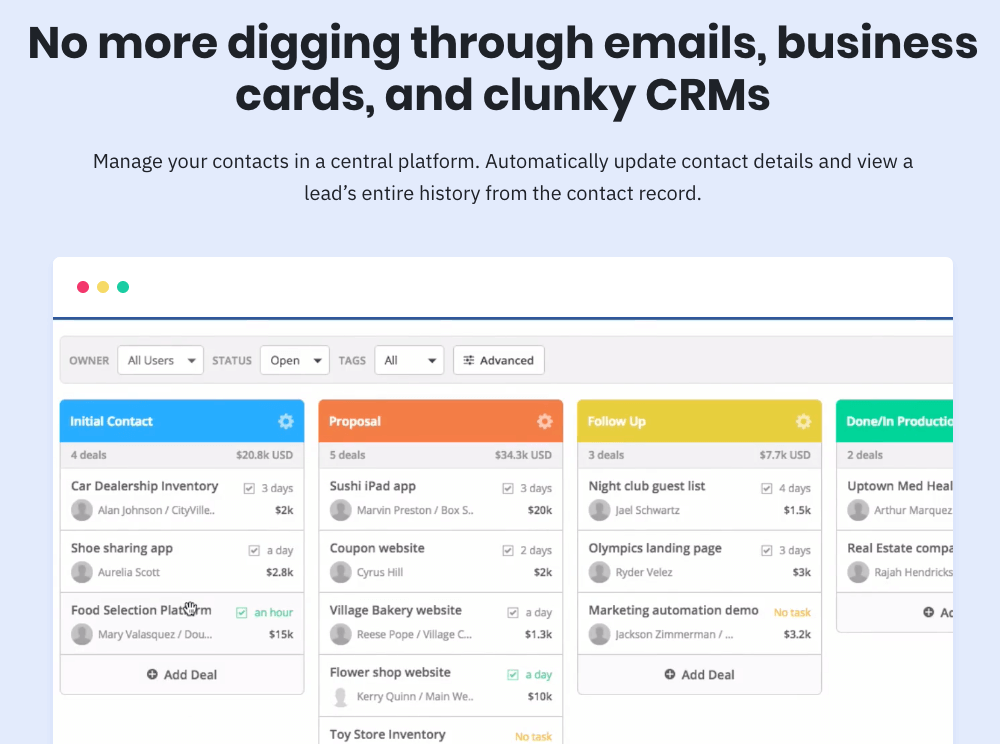 Sounds good to me
- “Keeping track of leads and setting reminders to follow-up with potential clients is maddening without the proper tools”
- “In the past, I had used more traditional methods of keeping track of my clients, such as: pen and paper, setting alarms on my phone, and trying to remind myself to consistently check in on my emails, social media accounts, voicemails, and even text messages.”
- “The biggest gripe I have with [competitor] is the lack of automation for Deals. We’re unable to copy critical info (such as lead source) from the Contact record to a Deal record, forcing our sales team to manually copy this info.”
- Lots of people were using a range of offline methods to track contact info
- People wanted information in one place
- For people already using CRMs, automating manual processes was important
- Ask them directly in interviews (these questions are a starting point)
- Survey them
- Look where they hang out online and do “review mining”
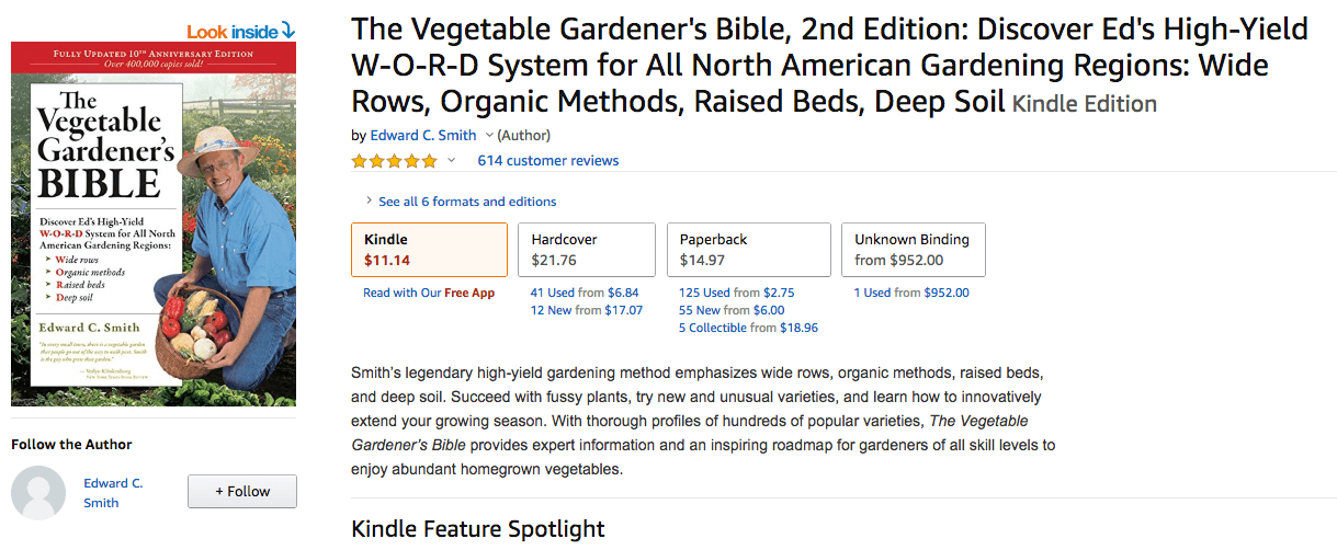 The bible seems like a good place to start (Amazon)
 So much information
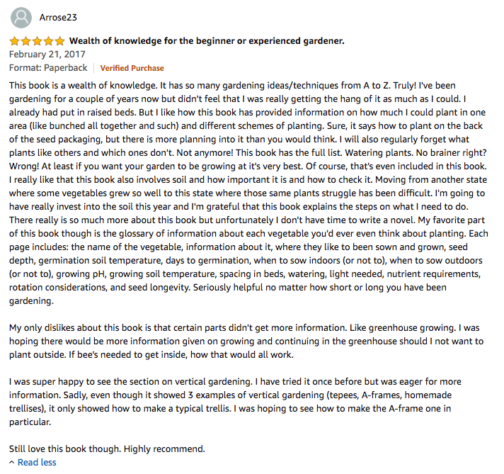
- “I’ve been gardening for a couple of years now but didn’t feel that I was really getting the hang of it as much as I could.”
- “I like how this book has provided information on how much I could plant in one area (like bunched all together and such) and different schemes of planting.”
- “Watering plants. No brainer right? Wrong! At least if you want your garden to be growing at it’s very best.”
- “Moving from another state where some vegetables grew so well to this state where those same plants struggle has been difficult.”
- “My favorite part of this book though is the glossary of information about each vegetable you’d ever even think about planting.”
- “Each page includes: the name of the vegetable, information about it, where they like to been sown and grown, seed depth, germination soil temperature, days to germination, when to sow indoors (or not to), when to sow outdoors (or not to), growing pH, growing soil temperature, spacing in beds, watering, light needed, nutrient requirements, rotation considerations, and seed longevity.”
- “Sadly, even though it showed 3 examples of vertical gardening (tepees, A-frames, homemade trellises), it only showed how to make a typical trellis. I was hoping to see how to make the A-frame one in particular.”
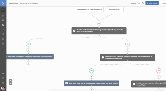
This automation can send contacts the lead magnet that best matches their interests. You can get automations like this for free in the ActiveCampaign Marketplace. Or you can click the button to import this automation into your ActiveCampaign account right now.
 If you wanted to garden, wouldn’t you want to know “how much you could plant in one area?”
If you were moving states, wouldn’t you want to know which plants will survive?
And how could you say no to “a glossary of information about every vegetable you’d ever think of planting.”
That last one could be a headline all on its own!
Not every review is a gold mine like this one, and you’ll want to look at a few more reviews during your research.
But you’d be surprised how often the perfect opt-in copy screams at you from an online review of a popular book on Amazon.
Don’t write your own copy. Outsource it to your customers—the greatest copywriters in the world for your business.
If you wanted to garden, wouldn’t you want to know “how much you could plant in one area?”
If you were moving states, wouldn’t you want to know which plants will survive?
And how could you say no to “a glossary of information about every vegetable you’d ever think of planting.”
That last one could be a headline all on its own!
Not every review is a gold mine like this one, and you’ll want to look at a few more reviews during your research.
But you’d be surprised how often the perfect opt-in copy screams at you from an online review of a popular book on Amazon.
Don’t write your own copy. Outsource it to your customers—the greatest copywriters in the world for your business.
Quick hits: Fast ways to punch-up your opt-in copy
The three most important ways to improve your opt-in copy are:- Be clear—impossible to misunderstand
- Say what you’re offering and how it will help
- Use the words your audience uses to describe their problems
- Add emotion. Emotion makes people more likely to take action—and copy that hits on “high-activation” emotions (like awe, fear, anger, envy, etc.) can convert better
- Add specific details. “Lose weight” is less compelling than “lose 2 pounds a week.” Details make your copy more convincing.
- Use the “even if” technique. Address your audience’s key objections up front. For example “lose weight—even if you don’t know how to cook.”
- Make it sound easy. Make signing up for your offer as easy as possible. Words like “get” or “see” are lower-friction than words like “learn” or “sign up.” Please don’t say “submit.”